
The creation of a list of intangible cultural elements to preserve (ICH, UNESCO) should be understood as a kind of reaction to the vast World Heritage List (WHC, UNESCO), highly politicized “wonders of the world” directory. For many reasons, related to the preservation of ancient monuments, the Western-centric definition of the terms “cultural” or “heritage” or because we find many European countries actively involved in United Nations programs, Europe is over-represented in the World Heritage list.
Comparing the “World heritage” and the “Intangible cultural heritage” distribution
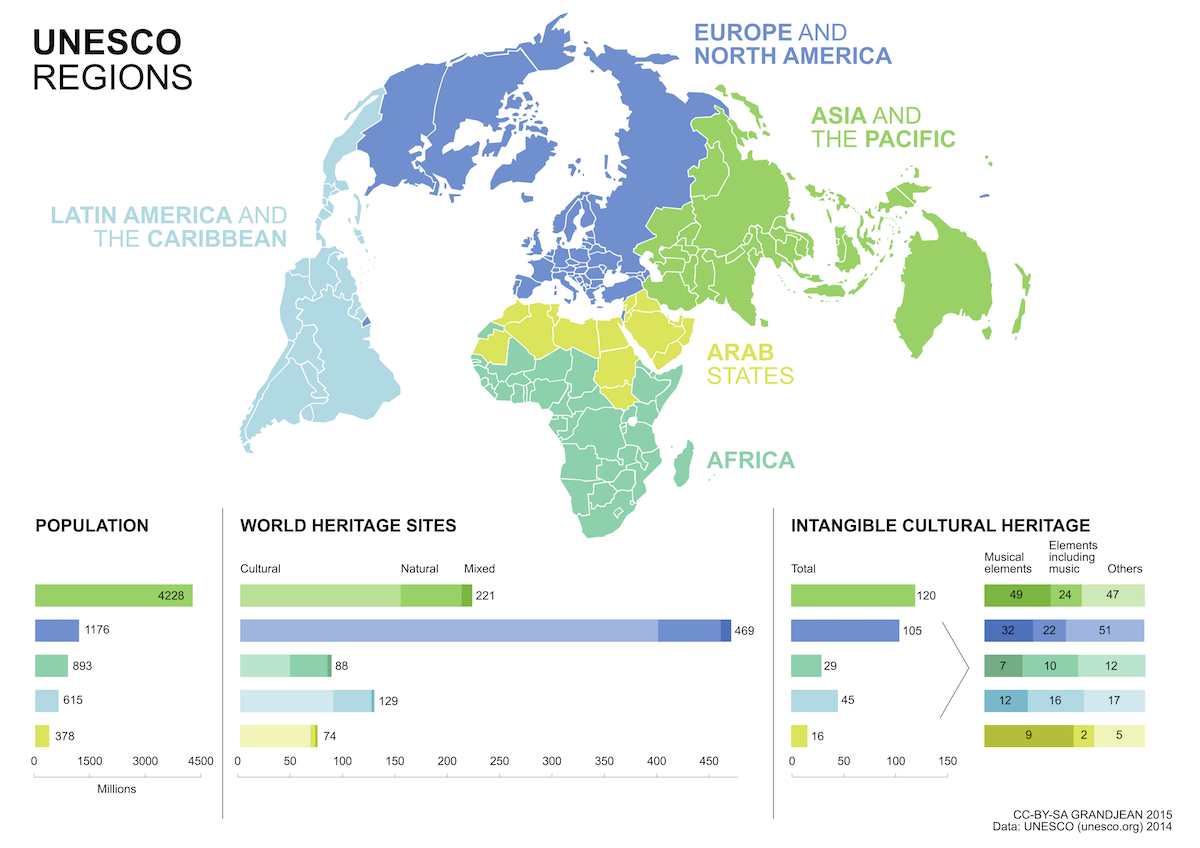 WORLD HERITAGE SITES – Europe and North America host 48% of the listed items, while these territories account for only 16% of the world population, a rate of 40 items listed for 100M inhabitants. By comparison, the rate is 5/100M in Asia, 10/100M in Africa, 20/100M in the Arab States and 21/100M in Latin America.
INTANGIBLE CULTURAL HERITAGE – Implicitly, the intangible cultural heritage directory aims to restore a form of balance, including a new element to list. As a result of a political choice to favor the marginalized elements, the number of intangible heritage elements in North America and Europe are less numerous (but still 33% of the new list). Asia, meanwhile, is better highlighted.
Mapping the intangible cultural heritage
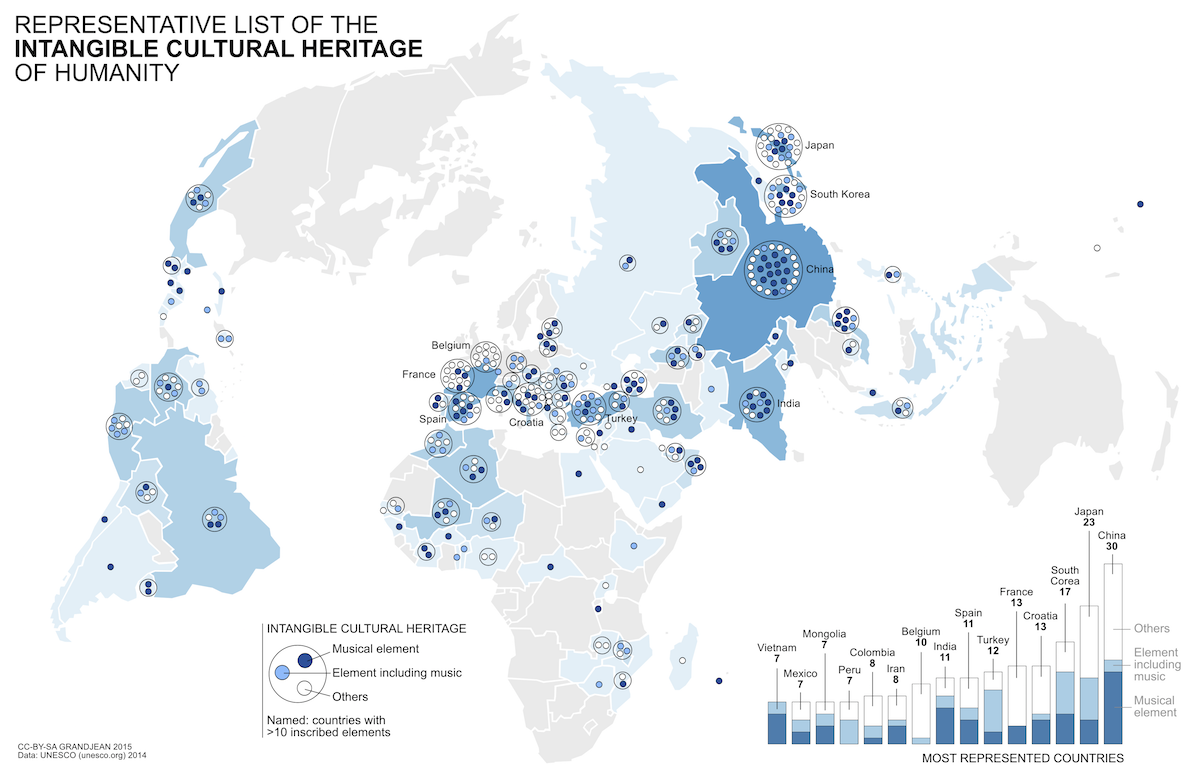
Music occupies a prominent place in the ICH list: of the 313 items recorded until 2014, there are 109 musical elements to which are added 74 elements including music.
Source: UNESCO.ORG (data until 2014)
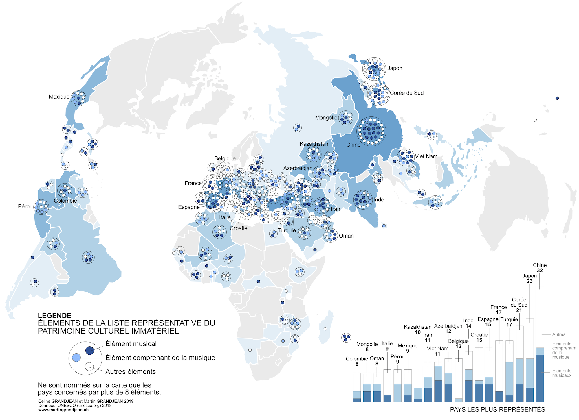
Update (2019)
This map has been updated with data until 2018 for the needs of a French musicology journal issue about intangible heritage. Find the introduction here (english version) and the new map below. Things have changed a lot in recent years, especially in Eastern Europe and Western Asia.
Martin, what is the name of this projection system?
Hi, thanks for the comment! It’s a Bertin 1953.
Lovely, reminds me of the old FAO maps
This really amazing. is it a mix of big data, and open data that has lead to this?
Let’s say that this data is openly available on UNESCO website (even if I’m unsure about calling it “open data” because this is a very curated list).
This is really inspiring work. What did you use to put the circular bound around the bubbles within a country?
Thank you for your message. In fact, this map is hand-drawn, that means that the circular bound is a simple vector object in Inkscape.