
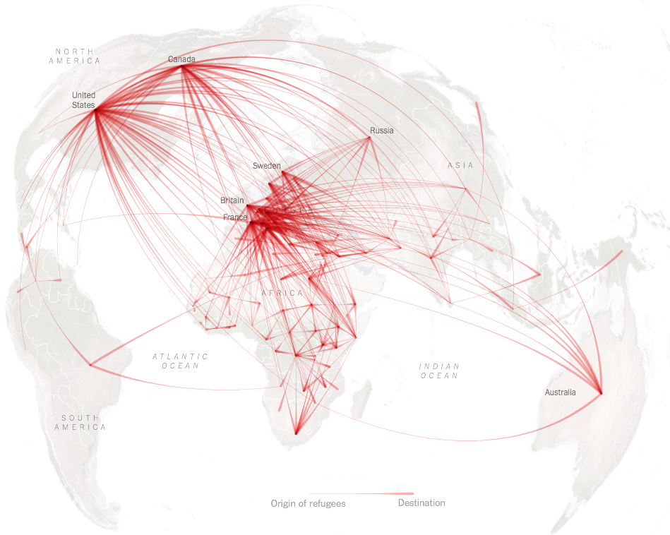
Based on a recent United Nations High Commissioner for Refugees report, the New York Times published a visualization of a very high graphic quality, mapping the 14 million refugees who fled their country in 2014. Beyond its undeniable qualities, this map is the perfect example of the need for datajournalists not be lulled by aesthetic. It’s a “blind” data visualization, suffering from two major readability problems:
– 1 The flows are not weighted: if there are 6,000 Mexican refugees in Canada, their edge will appear of the same thickness that a million Syrian refugees in Lebanon!
– 2 Giving more thickness to the edges at their arrival point, to show the direction of flow, is a nice graphical effect. But the consequence is clear: Europe and North America, with a high concentration of “endings”, are becoming very colorful while Africa and the Middle East are empty even though they host many more refugees (a smaller concentration of “endings”).
These two visual elements suggest that “The Flight of Refugees Around the Globe” is a race to Europe, while the data clearly show that it is wrong for more than 90% of them. As this chart had a great success on the internet, and as the sources are freely available on the UNHCR database, I spent a few minutes to propose another version:
Full size here. CC-BY-SA – Freely reusable with link to this post.
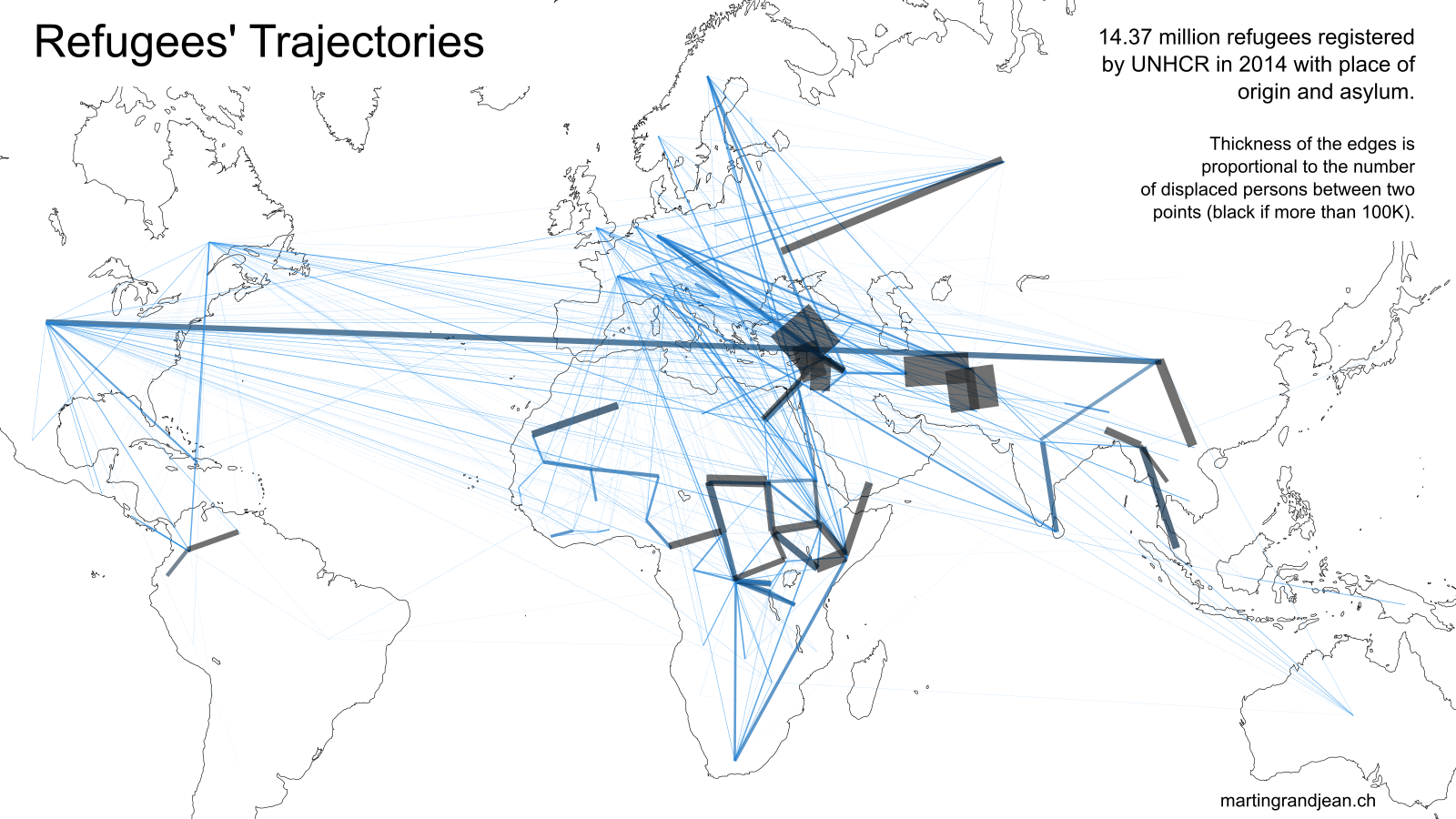
⬆︎ The map above displays the same information as the New York Times. We see very easily between what countries are the largest displacements: Syria and its neighbors, Afghanistan and its neighbors, conflicts in Chad, Sudan, D.R. Congo and Somalia, but also from Ukraine to Russian Federation. Visually, this map is much less aesthetic than the one produced by the New York Times, and its readability is not without problems (the edges between Syria and its neighbors are very short but very broad, making it difficult to understand their direction), but it displays a comprehensive overview.
Full size here. CC-BY-SA – Freely reusable with link to this post.
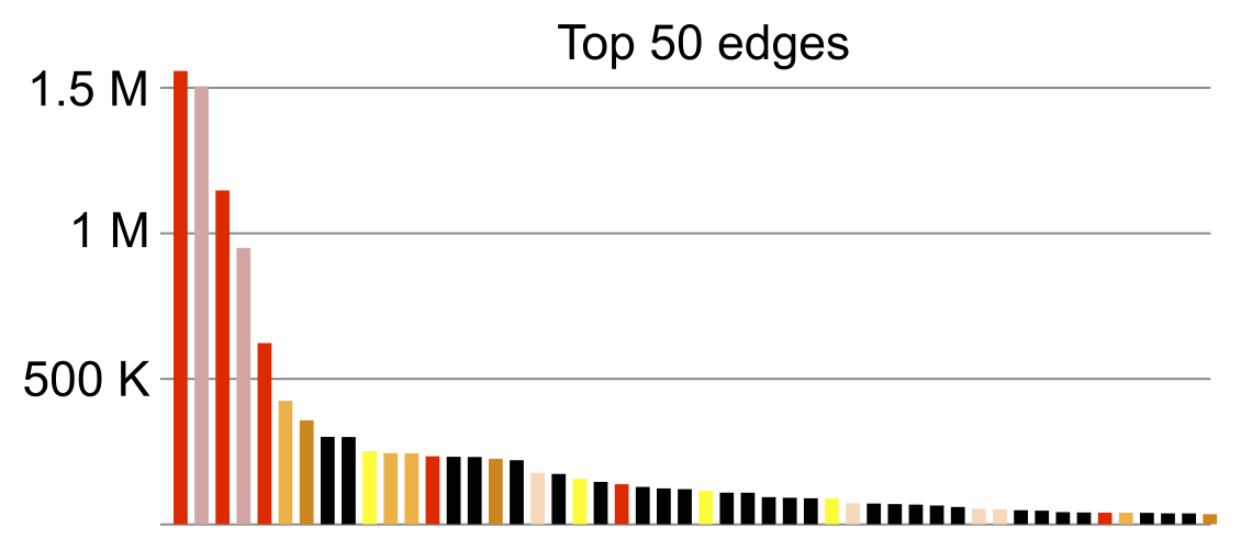
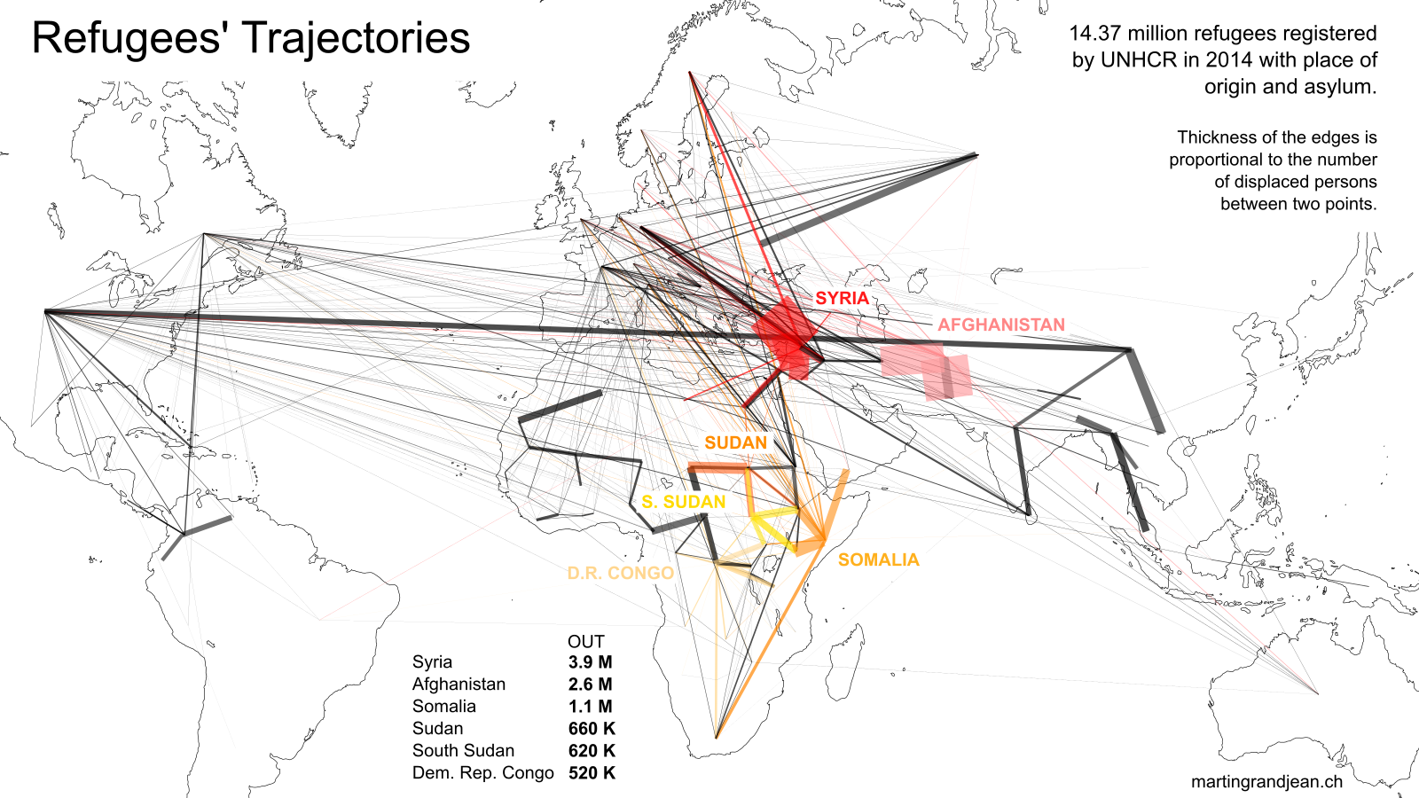
⬆︎ A small number of conflicts is the source of a large part of the displacements. Above, six countries are highlighted. They are concerned by a great majority of the largest edges of the map, as shown in the table (top 50 edges – relations between origin and asylum countries – with the same color code as the map above)
⬇︎ The map below highlights the European countries. Except for Ukraine, “Fortress Europe” is almost exclusively a refuge.
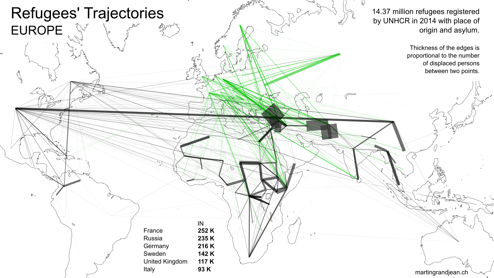
Full size here. CC-BY-SA – Freely reusable with link to this post.
- Made with Gephi.
SEE ALSO: Other refugees maps
- Déplacés internes et réfugiés selon le HCR 2010 (Sciences Po)
- Interactive flow map visualization (Ilya Boyandin – see source on GitHub)
Hi Martin,
You can apply edge thicknesses and it can still be aesthetically pleasing. Check out this map I made few years ago:
https://github.com/ilyabo/jflowmap.js
http://jflowmap-js.herokuapp.com/
Excellent work! My biggest regret is not to have integrated this geographical projection, which gives a nice dynamic aspect to the map!
Un hic dans la carte: we need to know perfectly how to locate the countries & the borders!
Excellente déconstruction analytique de la carte du New York Times très contestable tant ses choix de données et de présentation sont biaisés. Elle est même fausse, d’un autre point de vue : elle ne prend en compte dans les statistiques du HCR que les réfugiés “statutaires” (i.e.: reconnus comme tels après examen individuel dans une procédure nationale d’asile liée à la Convention de Genève de 1951 sur les réfugiés) et omet les réfugiés “prima facie” (i.e.: accueillis dans les camps de réfugiés que le HCR ou d’autres organisations créent en cas d’exodes massifs). Ces réfugiés prima facie, sont les plus nombreux (plusieurs dizaines de millions) et 90% d’entre eux restent dans un pays voisin du leur. En excluant cette catégorie de sa représentation cartographique le NYT fait plus qu’une erreur : il construit le mythe de l’envahissement. On voit ici à quel point les “Big data” et le quantitativisme vont décupler les erreurs et les formes d’ignorance.
Merci pour votre intérêt et vos remarques. Votre critique des données du HCR est légitime, et entre évidemment en résonance avec les débats qui ont lieu actuellement autour de la définition du “réfugié”. En l’absence d’autres sources plus complètes, je trouve néanmoins que ce jeu de données a une cohérence interne et peut être utilisé, avec les mêmes réserves que l’historien qui utilise un fonds d’archives pour documenter un événement et qui doit être conscient que le fonds, même s’il est complet, ne décrit qu’une facette de la réalité. Je ne qualifierais donc pas la représentation de “fausse”, mais plutôt de “partielle”, puisqu’elle se base sur une définition (critiquée mais aujourd’hui seul indicateur globalement admis) parmi d’autres.
Je vous rejoins sur la crainte que les “big data” et autres “open data” ne deviennent des arguments simplificateurs qui cacheraient la complexité des phénomènes en faisant croire au lecteur qu’il a tout devant les yeux.
Hi Martin,
I find that map very interesting. I’d like to understand how you made it. I know that this was made with gephi, but what I don’t know is how you got from the UN data to that map. Could you please describe how you achieved this?
Thank you for your comment. I use Gephi “GeoLayout” plugin to project the network on a map (with the coordinates of the countries), and then export the file in SVG to open it on a map background in Inkscape.