
A long time ago, in a galaxy (not so) far away… migrants were fleeing Europe! In the nineteenth century, hundreds of thousands of Europeans left their continent to find a better (?) life in the Americas and in the colonies.
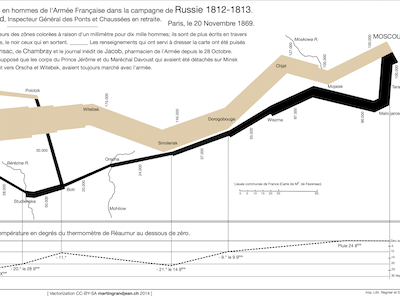
The Russian campaign is also vectorized.

The original map, on Wikimedia Commons.
The map below is a vectorization of the original map.
Based on 1858 data, the map of Charles Joseph MINARD (published in 1862) shows migration flows that contrast with the maps of the twenty-first century. That year, 86.000 Englishmen left their country, as 45.300 Germans, 20.000 French and 11.600 Portuguese.
Besides informing us about migration in 1858, this map is an early example of sankey diagram, which displays information as flows. It prefigures the famous map of Napoleon’s Russian campaign by the same author (1869).
The 1858 Map of World Migration (vectorized)
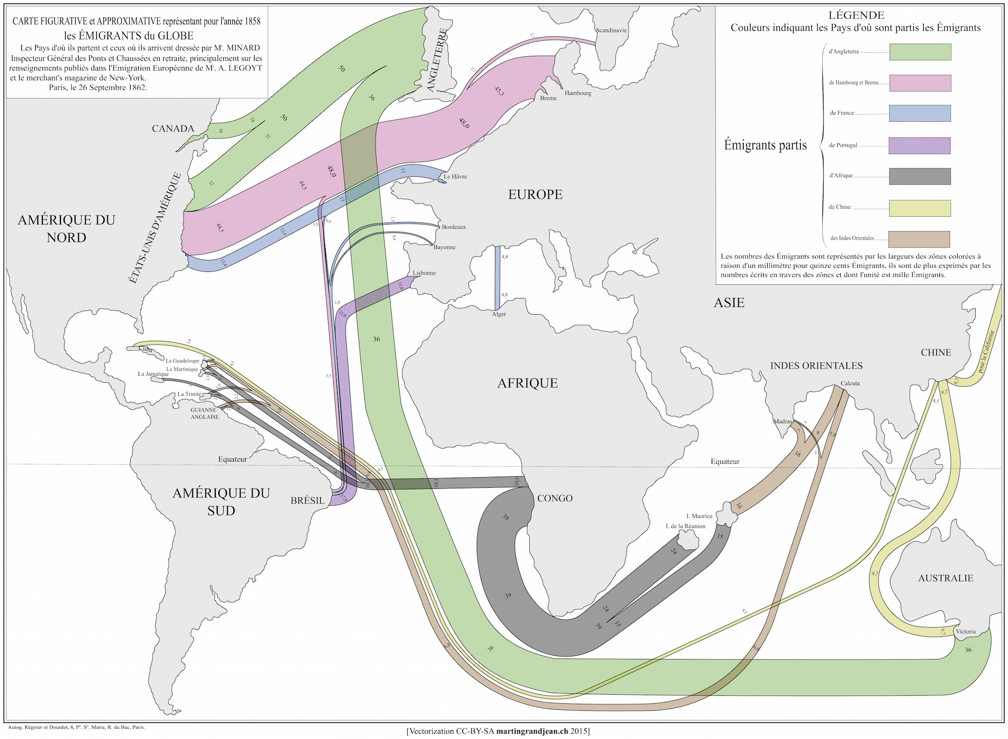
Charles Joseph Minard’s World Map/Sankey Diagram of Migration 1862. CC-BY-SA Freely reusable with link to this post. [Full size here]
Trackbacks/Pingbacks