
The aim of this post is to provide the community a vectorized version of Minard’s Map. Feel free to use it: [button size="medium" color="black" style="none" new_window="true" link="https://commons.wikimedia.org/wiki/File:Minard%27s_Map_(vectorized).svg"]Vectorized Map on Commons[/button]
Generally considered as the first data visualization, the figurative map of Charles Joseph Minard (1869) shows the path of Napoleon’s troops across the Russian Empire of Alexander I. Using amazingly simple and modern graphical codes, this map displays the progress of the troops in the form of a stream whose width indicates the size of the “Great Army”, which will dramatically decrease throughout the campaign.
Although it is reasonable to ask whether this Figurative Map of the successive losses in men of the French Army in the Russian campaign 1812-1813 is indeed a “data visualization” (in itself, it is a drawing that summarizes information), this map is the central piece of an impressive number of articles, analyses and talks1. This post is a contribution to the study of historical data visualization. In addition to a faithful vectorized version of the original map, it offers a “geographical” and a “historical” map based on the model of Minard.
MINARD’S MAP VECTORIZED
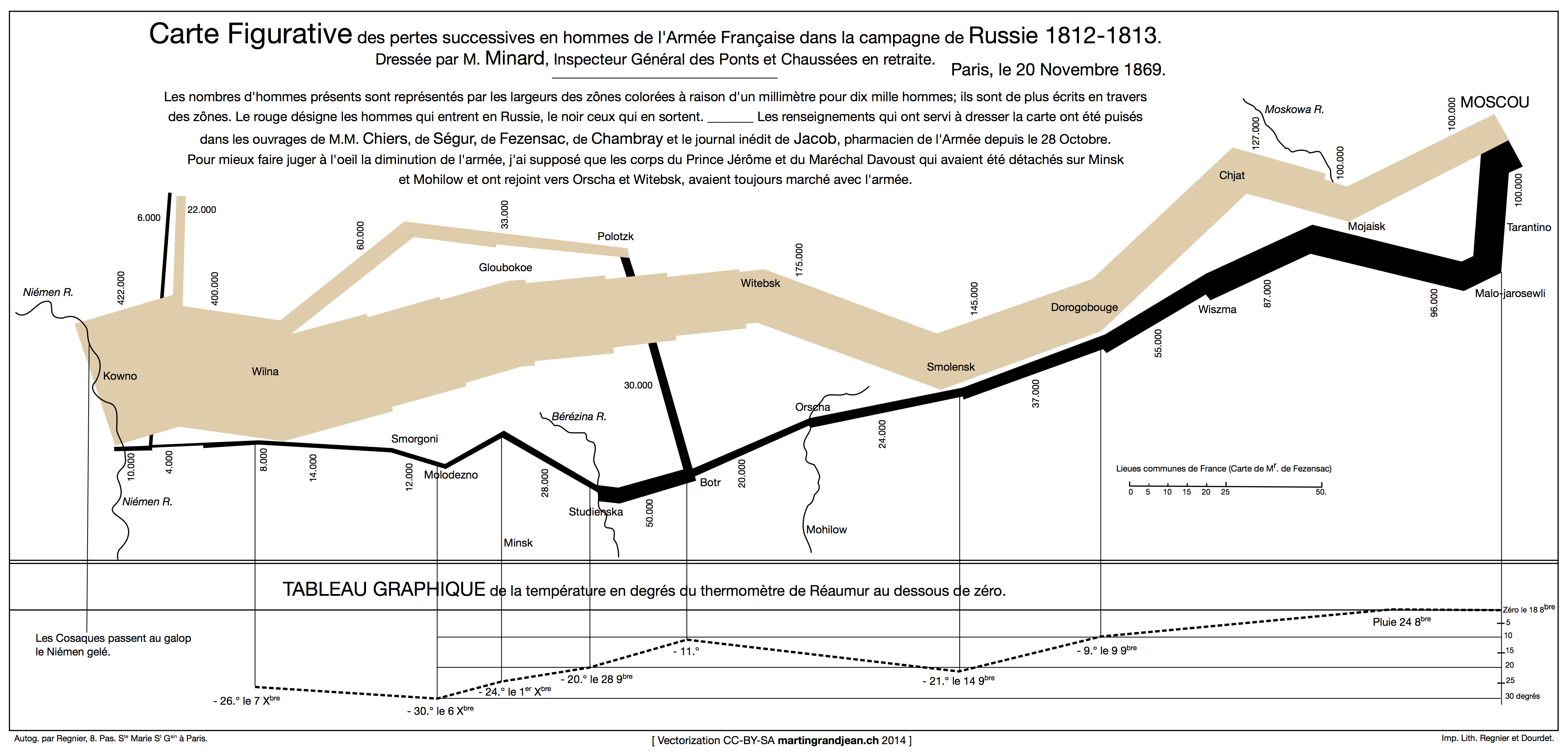
The original map shows the road to Moscow in brown and the way back in black. The path is simplified into a single stream, as explained in the description of Minard, under the title. Only a few cities are displayed, the path is summarized in segments between these points. On the way back, a graph shows the temperatures at irregular intervals. For readability reasons, the text was not drawn with the same font but rewritten clearly (see the original on Wikimedia Commons).
Full size (PNG 4500×2100)Vectorized (SVG)
.svg)
.
MINARD’S MAP: GEOGRAPHIC DISPLAY
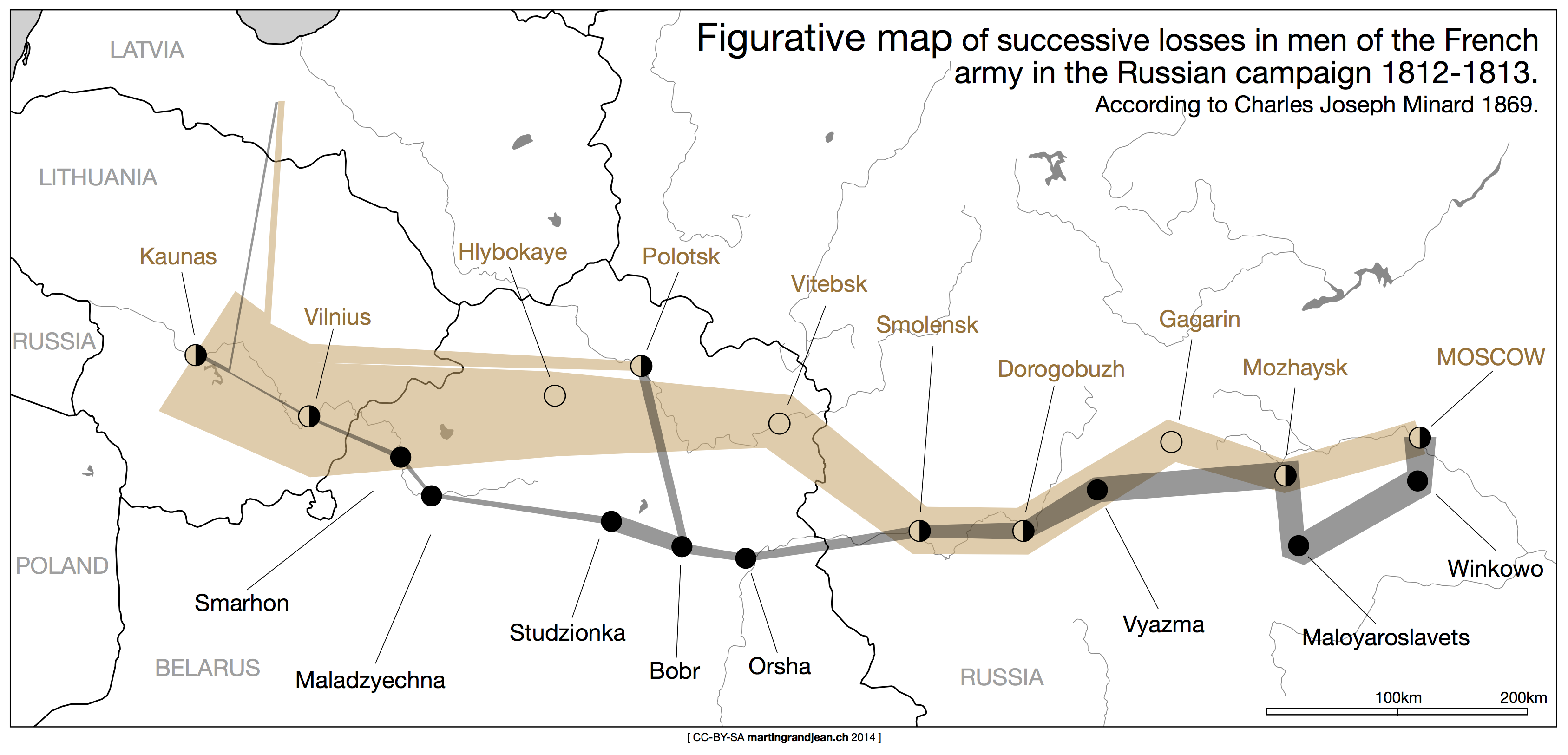
Using data from Minard, this map projects the path taken by Napoleon’s troops in the geographical reality. To make this map understandable, places and borders reflect the current situation (2014). Brown/Black dots indicate the cities crossed twice.
.
MINARD’S MAP: THE HISTORICAL MAP
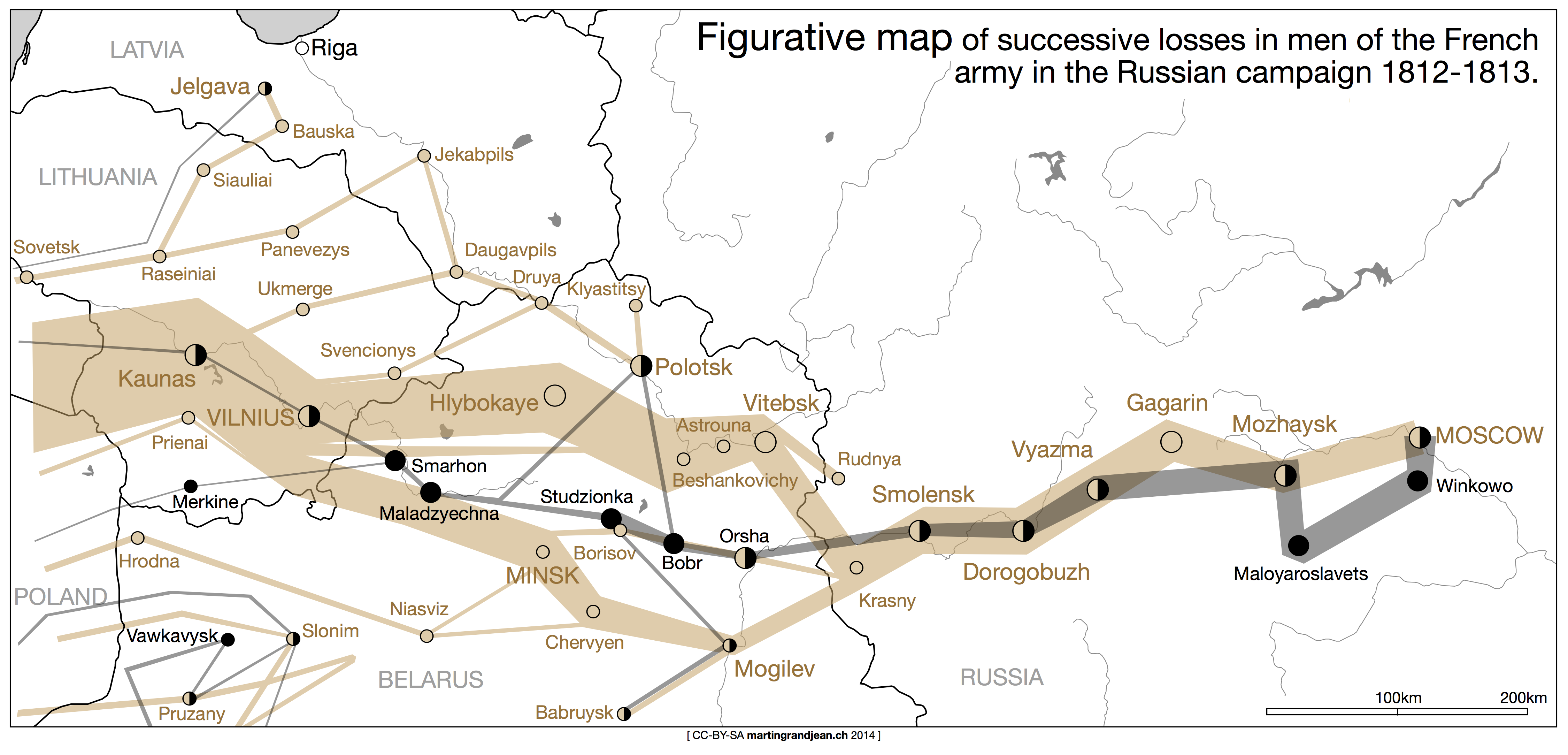
The reality is not as simple as the visualization of 1869 suggests: Napoleon’s army was divided into several corps which followed different paths and fortunes. This third map combines Minard’s codes and the most accurate informations we have about the actual route of the different corps of the “Great Army” (for visual documents, see map1/map2, also on Wikimedia Commons). The small dots indicate the places that Minard didn’t mention.
.
Feel free to discuss these visualizations through comments and to use these images.
- Popularized by Edward Tufte (his website/on Twitter). ↩
Nice work, thanks ! Note that while a few people (including Tufte) believe that this may be the best data visualization ever, I don’t think it has been labelled as the first. William Playfair would predate it, for sure (Playfair’s representation are not as sophisticated, for sure, but they are still data visualizations).
This was posted on reddit: I assumed it was you who posted it, but apparently not, so I am just repeating my comments here:
I think it needs a legend. Without it I’d have no idea what the half-circles represent. And am not sure I would understand the difference between the brown and gray bars, or what their width even means if I hadn’t seen the original.
Of course you explain it in this article, but that means the visualization does not work on it’s own. At least, Minard’s has the text embedded in the image.
>Brown/Black dots indicate the cities crossed twice.
Is that important enough to warrant its own symbology? You could derive it from just seeing where black and brown bars cross. I think I’d rather see labels with the size of the armies here and there, plus maybe markers indicating important events (battles, river crossings).
All in all, really interesting project. But, of course, it’s hard to improve on a classic.
Thank you so much for bringing the discussion here (it wasn’t me on Reddit, I’m not a very experienced user) !
You’re absolutely right about the legend, some also made me remark on Twitter about it. The reason for these differences in size and color of the circles is due to the fact that Minard only cites some, and is not clear when a city is crossed twice. A legend for the size of the army would be interesting, but Minard sometimes cheat a little to make fine lines visible. 😉
It is clear that additional legend documenting major battles would be exciting, but it is precisely the opposite of Minard’s work (unlike military historians). Difficult to know to whom I must be faithful, but it raises good questions.
Thank you very much for these interesting re-creations of Minard’s famous map and the discussion. I am wondering whether the data you used is available – particularly the one used for the “historic” variant. Also, do you know of any temperature data being available for the eastbound part of the campaign?