

Figure published in Messerli (2012) Chocolate Consumption, Cognitive Function, and Nobel Laureates, New England Journal of Medicine (full paper here).
Is the number of Nobel laureates by country correlated with chocolate consumption? This chart has quickly become very popular on the internet since its publication in 2012 in the New England Journal of Medicine. Visually, the little flags seem to be aligned on an imaginary line showing the amazing correlation between the number of Nobel laureates for 10M inhabitants and chocolate consumption in these countries.
Before realizing that it was a parody, many articles, blogs and media showed that this apparent correlation does not make sense and this chart quickly became a “reference” (to show the limits of this kind of analysis). These critics obviously show that the number of Nobels for 10M population is also “correlated” to GDP/capita, human development index, consumption of all kinds of luxury goods, etc.
But the quest for the perfect correlation is not the only problem here! Based on the graph only (usually without reading the original paper), critics forgot to look at the data used. The little exercise that follows does not claim to restore “scientific truth” since this paper is a joke, but is a discussion item about a visualization that is now part our “dataviz” popular culture.
Variable sources = imprecise graph
An analysis that is based on ill-defined data can only be imprecise. The graph below shows how the variability of these data during a 10-year interval, and according to several sources, changes the result: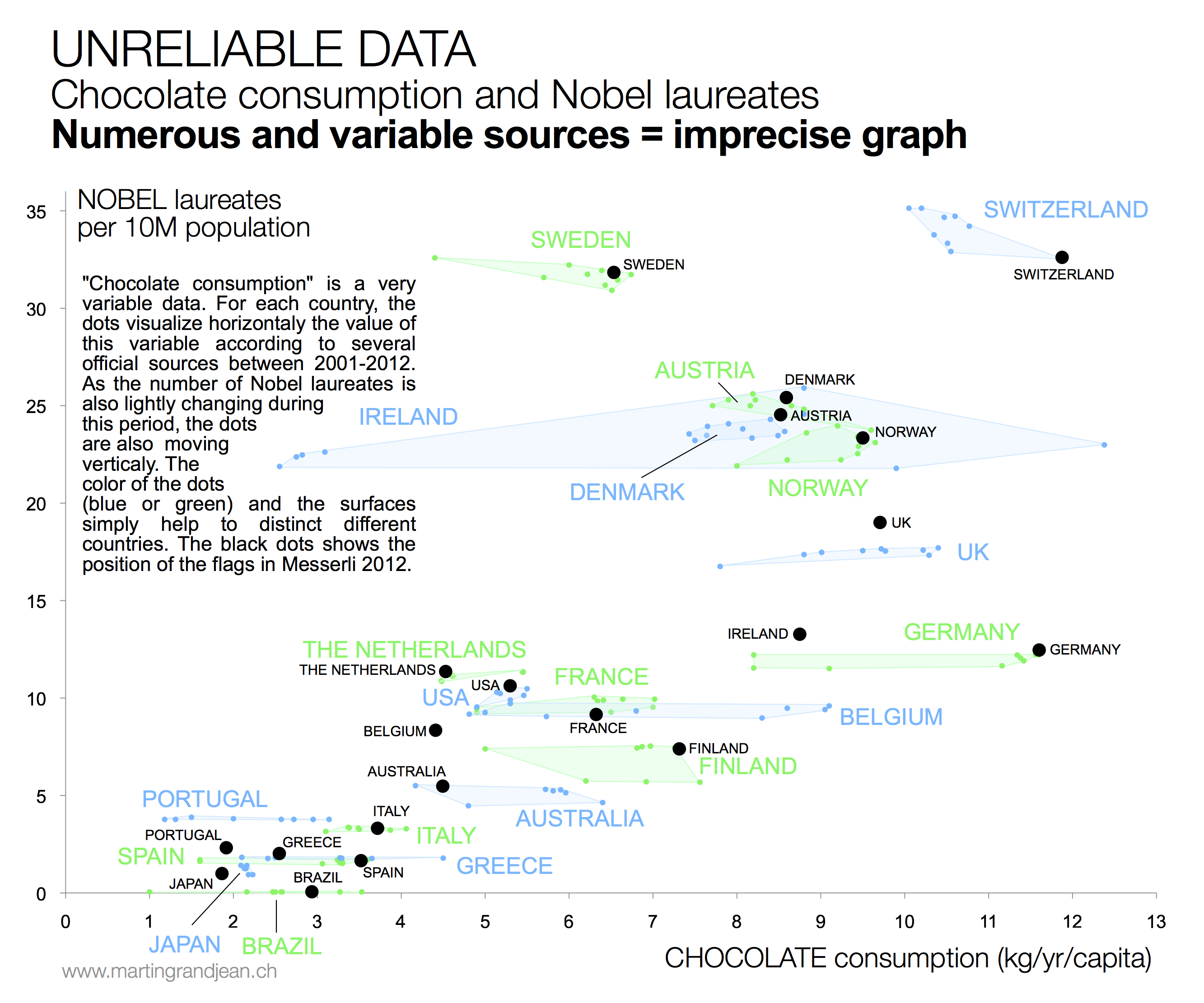
The data are of two types:
Nobel laureates – “A list of countries ranked in terms of Nobel laureates per capita was downloaded from Wikipedia” (Messerli 2012,1) Here’s the Wikipedia page. Wikipedia data is not a problem in itself. The problem is that another page exists, with different counts: List of Nobel laureates by country! It’s a reality: it is common to change nationality and/or that the place of birth is not the place of residence at the award, especially among the scientific population who travel a lot.
Chocolate consumption – “Data on per capita yearly chocolate consumption in 22 countries was obtained from Chocosuisse, Theobroma-cacao and Caobisco. Data were available from 2011 for 1 country, from 2010 for 15 countries, from 2004 for 5 countries and from 2002 for 1 country” (Messerli 2012,1). Here, the joke is obvious, but rightly parody difficulties that statisticians often encounter. These data are very broad estimates procured by actors of this industry, they cover different years and are highly contradictory from one source to another! Sources: theobroma-cacao.de / confectionerynews.com / chocosuisse.ch / caobisco.
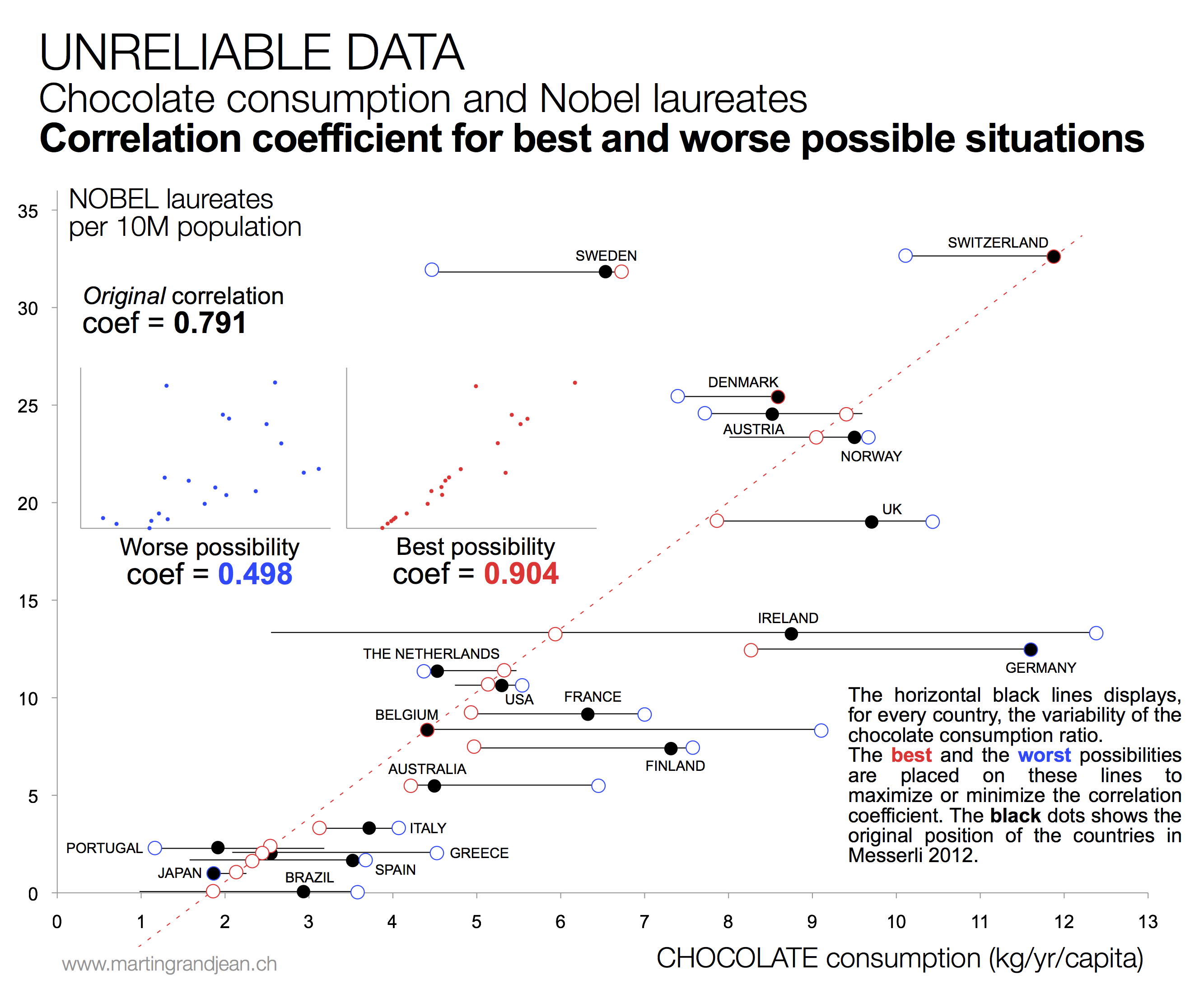
What about the correlation?
In fact, the author of the study simply chose a “chocolate consumption” value from a multitude of others. The chart below summarizes the extreme positions that could have been obtained, compared to the correlation presented in Messerli 2012:
 Conclusion
The “flags” graph is not only badly thought out, but its data are also wrong. Even if such paper was published as a joke for a few colleagues, it does not promote public understanding of science, statistics and medicine.
 READ ALSO – If you like the “remastering” of popular data visualization, take a look at the vectorization of Minard’s historical map.
Nice work. I pointed out some of the data problems at the time: http://www.statschat.org.nz/2012/10/12/theres-nothing-like-a-good-joke
I think the worst data problem is that the Nobel Prize data is cumulative back to 1901, so the chocolate data is decades too recent to be a good proxy for chocolate consumption at the time.
The correlation is simply spurious. Chocolat consumption and level of research both depend on GDP:
http://jn.nutrition.org/content/143/6/931.short