
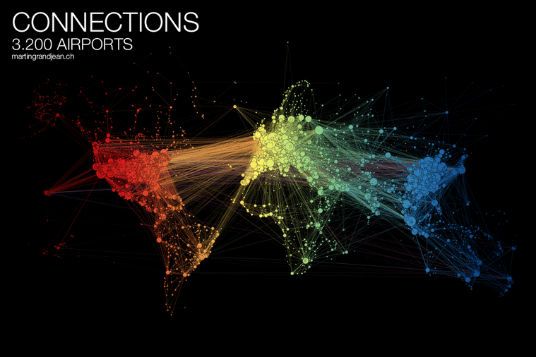
 People travel not just more frequently, but increasingly far and quickly. Mapping the connections between all the airports worldwide is a fascinating network visualization exercise.
A network, in its very essence, is already a map. And the global transportation maps that represent the flight connections rarely make this network intelligible: on a world map, Europe is often a very dense area where it’s almost impossible to distinguish the dots/airports. Ultimately, these maps (sometimes very beautiful objects), do not represent the data itself, but some idea of the complexity and quantity.
This post (which may be followed by further experimentations in this area) is an attempt to make explicit the network behind air transport. The structure of the relationships has an impact on the spatial distribution of nodes in a graph. Let’s see how this landscape is reorganized without geographical constraints.
FROM THE MAP TO THE NETWORK
THE NETWORK
See the full size picture
CC-BY-SA Freely reusable with a link to this post
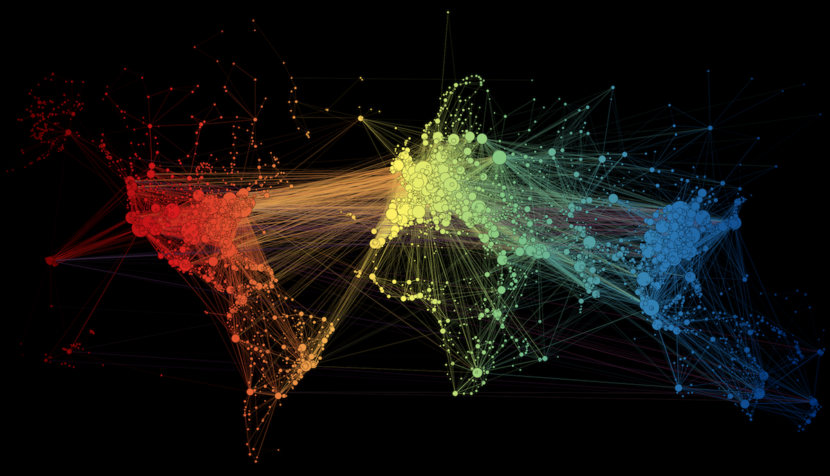
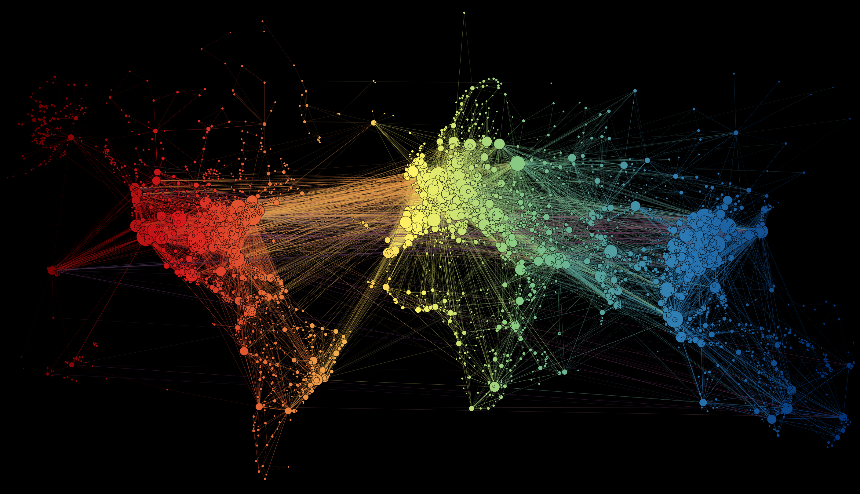
This “map” is the result of the application of a force-directed layout algorithm on a graph of 3.275 airports (37.153 single routes – the weighted total is higher because many airlines take the same route), based on OpenFlights.org data. Naturally, network geography is not completely disrupted: the continents are mostly visible and regions are generally in their original position (with the exception of the Pacific islands that connect Asia and America – imagine this graph in three dimensions, with the Pacific Ocean behind). Major observations: India is more connected to the Middle East than to South and East Asia. The Russian cluster is very visible, connecting airports in Russia but also in many former Soviet republics. Latin america is clearly divided between a South cluster and a Central American cluster very connected with the U.S.
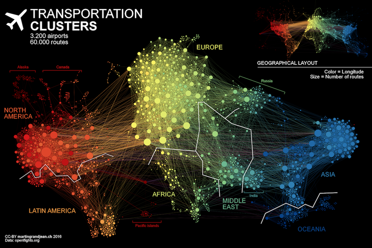
Bonus, the geographical layout of the same graph.
THE MAP
See the full size picture
CC-BY-SA Freely reusable with a link to this post
Shared by Matthieu Totet on Twitter: World flight routes worth to be seen!
How did the Pacific Islands end up between Latin America and Africa?
Every map is a 2D projection of a 3D reality. Here, the Pacific Islands are not “between Latin America and Africa” but “behind”, as they are connecting Asia and America. On such a graph, the position of a node is not as important as its connections, and sometimes, when the node is connected to 2 others that are very far, its position will be in the middle between them.
There are no connections between North America and Asia? That is a pretty big miss if you are representing this as a complete may for the given airports.
Connections are displayed! But you’re right, they are hard to see, especially on the geographical version (2nd here). The lines are purple.
We talk about a network, which is the 2D projection of a 3D reality (on a globe). The connections between North America and Asia therefore pass “over” Europe (but in fact, they pass in the background, behind). On the geographical map (but this map was not the aim of this study), we generally draw these America-Asia lines leaving on the left side and then arriving from the right. But that’s exactly the interesting point in network analysis: leaving this geographical fact to see if the 2 “poles” (red and blue, here) are attracted together to form a triangle with Europe (yellow). Result: no, the connections above Pacific Ocean are not sufficient to make these 2 clusters attract themselves more than the attraction of their intermediate European cluster.
Note also that a there is hundred times more internal connections inside North America than from that territory towards Asia.
What tool did you use to make these visualizations? Gephi?
Right, Gephi!
Belle production. Pourquoi y at-il pas de vols entre l’Amérique du Sud et l’Australie? Ou entre l’Afrique et l’Amérique du Sud? Ou entre l’Afrique et l’Australie?
Ces vols existent, mais les routes sont très peu nombreuses (ça, c’est une réalité du réseau aérien) et également peu parcourues par rapport aux autres. Comme les traits sont pondérés en fonction du nombre de vols sur chaque route, ces traits sont parfois extrêmement fins en comparaison.
Love the representation. Is this available for use as a vector file? .svg .ai or similar? It would be great to make this larger without loss of fidelity?
Love the representation. Is this available for use of connectivity raw data? Such as .csv file. Thanks.
Do you mean using the source files of this visualization? (it’s linked in the post)
Hello Martin, may I ask if you can provide the .gephi file?
Hi! I can’t find it (it’s quite old already), but the OpenFlights website is still available (https://openflights.org/data.html) and it was very easy to extract there.
I’d love to see the geographical layout, but with the lines being allowed to go through one side and coming out the other when picking the shortest line.
Hi, I need to use a tool to make maps similar to yours. What tool have you used?
Thank you 🙂
Hi, here the tool is Gephi (https://gephi.org). I did a tutorial here: http://www.martingrandjean.ch/gephi-introduction/
Hey Martin,
I just wanted to thank you again for allowing me to re-create this viz within Tableau!! I love how it turned out, and with your help it made the process so much easier/faster! There’s going to be a version 2.0 with a ton of interactivity.
Thanks,
Chris Conn
Hi Christopher,
How can this be made in Tableau? Can you please share the details?
I do not like it that Oceania is such a dark blue and overly similar to the Asian hue. We are getting sensitive about that down here as we get increasingly subjected to all kinds of interference from China, who have a very large immigrant population here and for whom this region is strategically militarily/economically a target for control. We like green and yellow, but that’s a bit difficult if you insist on a continuous spectrum. Perhaps a less undesirable colour scheme could have your USA red morphing through crimson/violet/purple/blue/turquoise/green/yellow and finally through to orange for Oceania… with the orange nice and distinct from the yellow of Asia. And that would reflect the true situation in which the hegemony that China is attempting to gain over us is already a fait accompli by the US. I’d love them all to just F off, but – well- some colours that please the soul would be a small help.