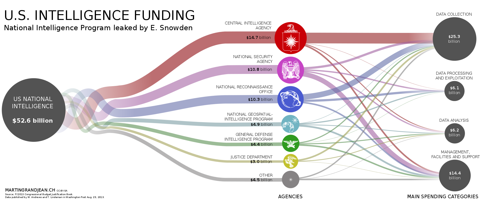
The top-secret documents recently released by Edward Snowden through the Washington Post reveal the funding of the U.S. intelligence agencies. To complete the great work of the graphic designers of the Washington Post, I propose that simple overall visualization:
 Full screen here. (CC) license – freely reusable with link to this post.
[threecol_one_first]
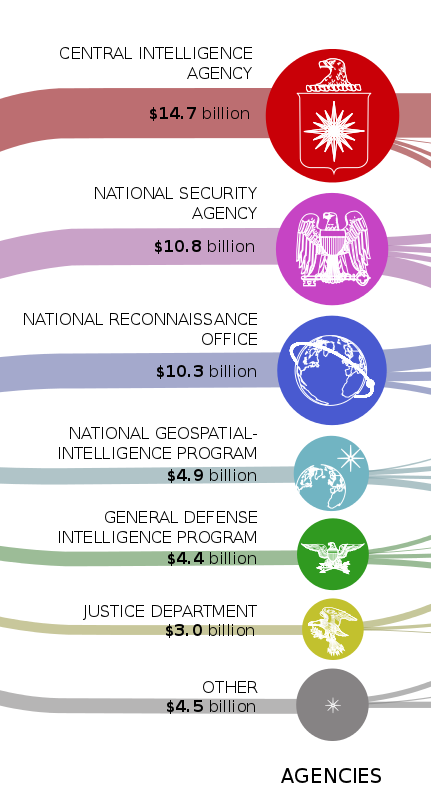
It appears that the 2013 budget of the National Intelligence Program totaled $52.6 billion. This sum is divided among a multitude of actors, but five agencies are particularly endowed: CIA (28%), NSA (21%), NRO (20%), NGP (9%) and GDIP (8%).
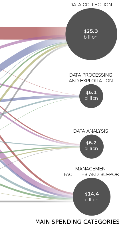
About the use of money, four category are distinguished. An important part of the total amount is spent in the “data collection” category (gathering raw information, surveillance, satellites, covert actions…). The data is then exploited and analyzed. The “management” category is also financially important (determining issues and tasks).
[/threecol_one_first][threecol_one]  [/threecol_one][threecol_one_last]
  [/threecol_one_last]
I recommend you to visit the beautiful black/white interactive graphics of the Washington Post :
And do not miss all the additional resources! I find this work remarkable. I just regret the lack of an overall view, which is why I offer this modest contribution.

Dear Martin,
what software do you use for data visualization?
Thanks!
Thank you for your interest! I forgot to mention it in the post, this is the Gephi software (as weird as it may seem), then worked on Inkscape.
Excellent! I was about to ask the same question, in particular because I like those connector flowpaths.
Impressive and easy to decipher. An improvement over the rather stylish, but difficult to get info out of, data presentation in the Washington Post.
Yes, their visualization is very interactive, but I’m not sure it is very “visual” and understandable at a glance.