
This post is a collaboration with Yannick Rochat, with whom I managed the official Twitter account of the congress (@DH2014Lausanne), and who took care of data archiving and processing. He also published a post that I recommend: The DH 2014 Conference in Lausanne – A feedback.
It is now common in the field of digital humanities: the public of the lectures is at least as much present on Twitter than physically in the room. From July 7 to 12, the annual international conference of Digital Humanities DH2014 was held on the campus of Lausanne, at the invitation of LADHUL (UNIL) and DHLAB (EPFL) and brought together more than 750 researchers from all around the world. During this same period, 16,000 tweets were sent by almost 2000 users. This post, as well as the one from my colleague Yannick Rochat, provide a few visualizations of these intense discussions to the community.
The complete #DH2014 Twitter network
The graph below represents all the “mentions” contained in the #DH2014 tweets (a tie connects two users when one mentions the other at least once in a message). The size of the circles indicates the number of tweets sent. The intensity of the color depends on the number of incoming mentions (in degree): the more a user is mentioned, the clearer the color (from blue to white between 0-100 mentions, and white for more).
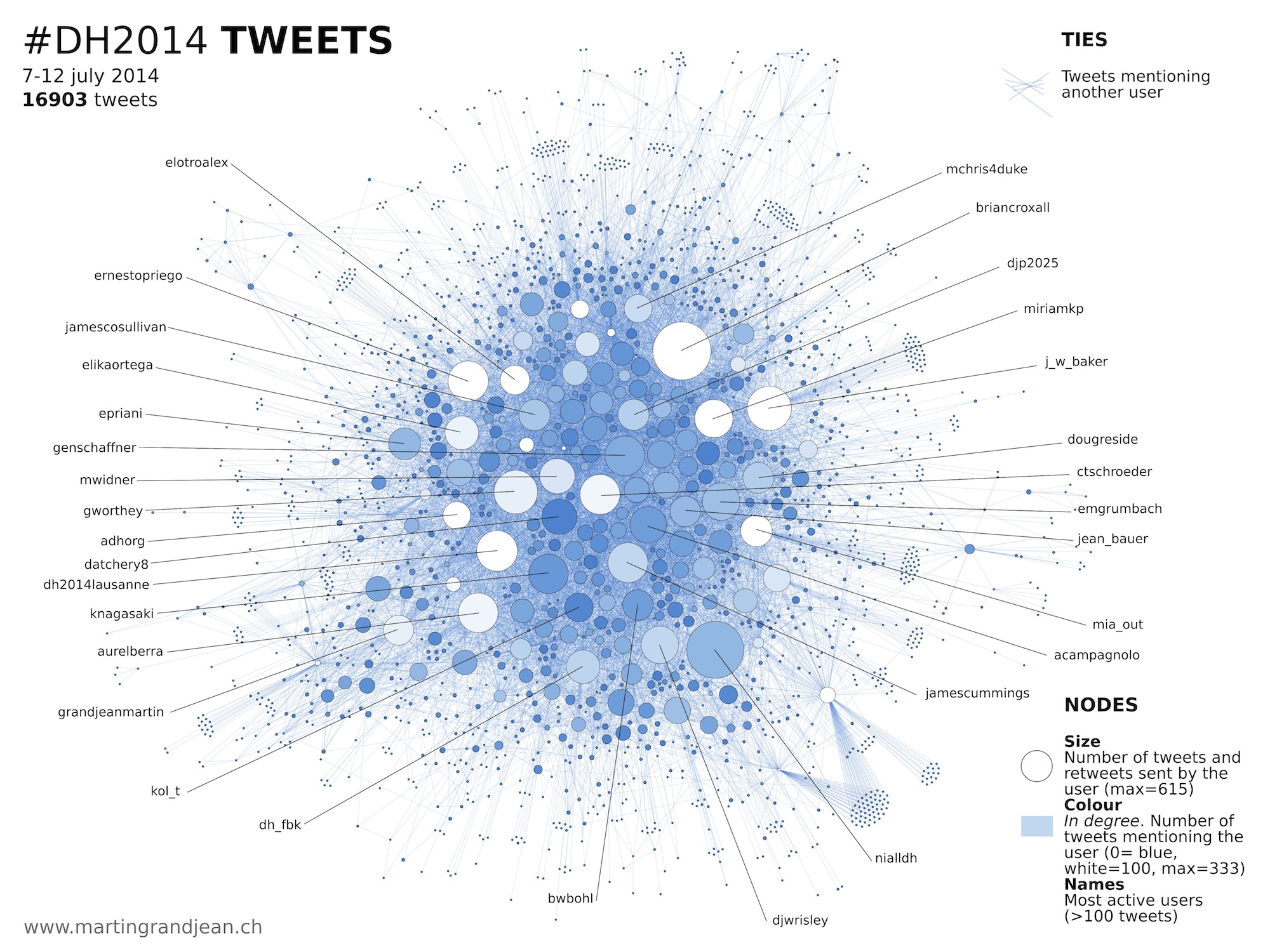
It appears that the most active people are not necessarily the most mentioned people. When a member of the public “live-tweet” a conference, the followers do not respond to all tweets. Inversely, the keynote speakers are massively mentioned during their talks (Ray Siemens, Melissa Terras and Bethany Nowviskie appear as small white circles above).
This network is very dense (even with a strong force-directed algorithm). It is interesting to observe that no community is separated, even partially, from the main cluster: probable sign that users follow the hashtag with discipline and responded to everyone rather than follow some particular individuals. In detail, however, the connoisseur recognizes interest or language communities.
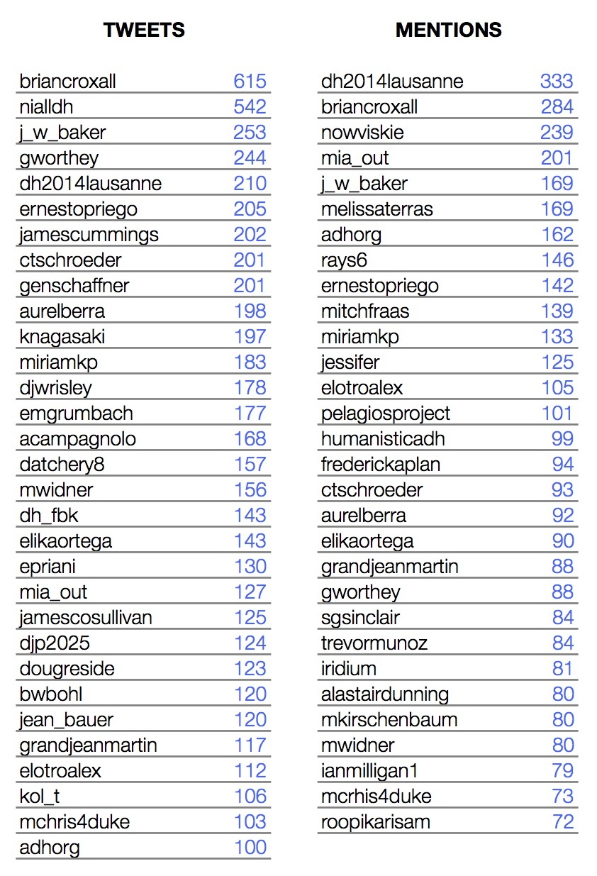
In the right pane, we observe that the list of users who have sent more than 100 tweets does not correspond with that of users that have been mentioned more than 70 times. In addition to the three keynote speakers mentioned above, institutional accounts like @DH2014Lausanne, @ADHOrg, @PelagiosProject and @HumanisticaDH were also much mentioned.
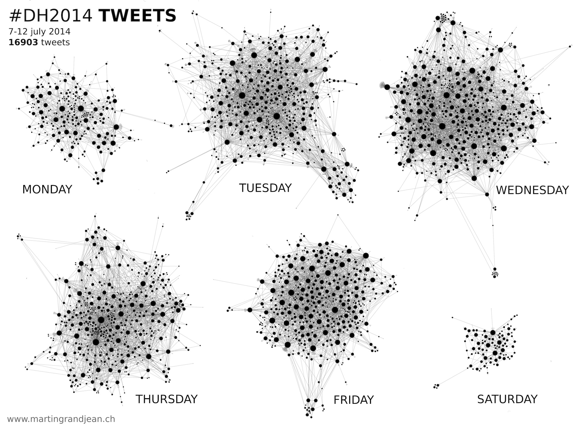
#DH2014 day by day
The mass of tweets is unevenly distributed in time, something that the complete graph does not reveal. Yannick Rochat has produced a histogram that shows the number of tweets sent every 10 minutes. It easily distinguished keynotes (especially Bruno Latour on Tuesday) and conference sessions. Coffee breaks and poster sessions are clearly less suitable for tweets.
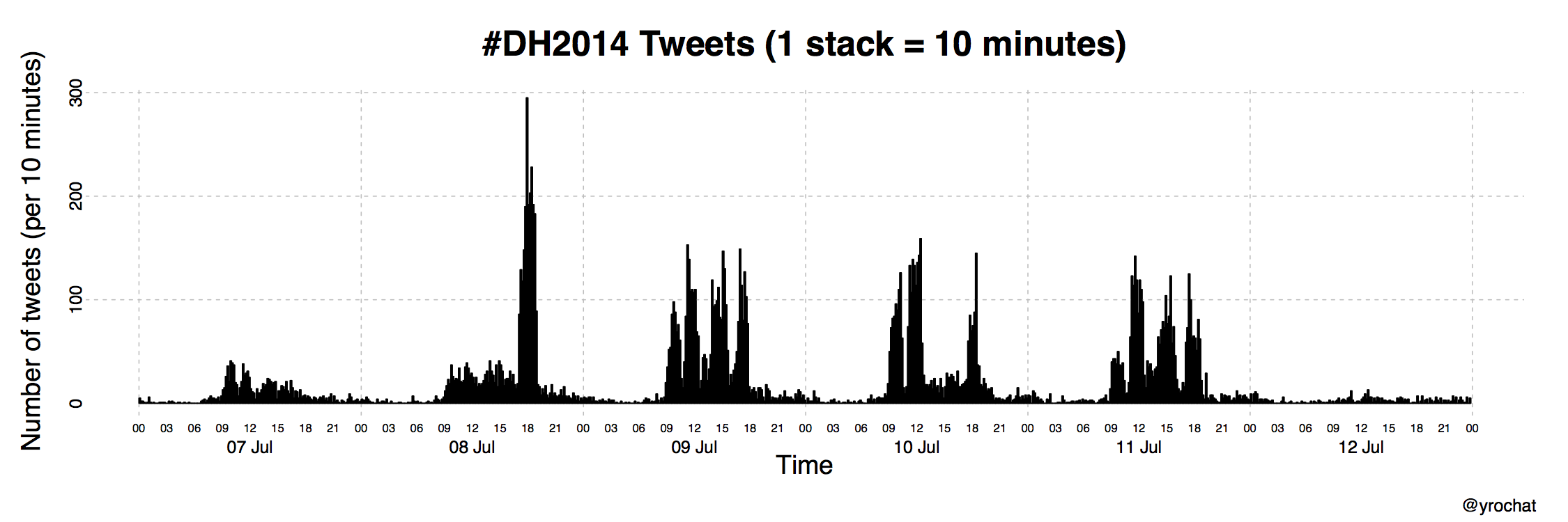
Plot by Yannick Rochat (EPFL) – Original post
In a more visual and instinctive approach, global signatures of the six daily graphs are also instructive:
If you have published a report on the conference, please leave the link below in the comments, I’ll add it to this post!
This is very cool, thank you so much for doing this.
It would be important you shared the source dataset. I asked Yannick for it and he kindly shared it with me via Twitter.
It fascinates me the shared dataset has removed usernames (not from replies/mentions metadata though) when this data viz is all about the usernames. In other words, without the usernames you could have not done this visualisation, but without them in the shared datasets others cannot. For me, sharing the source data is essential for reproducibility, particularly when the data was originally openly available and contributed by a community.
I wrote this post on Twitter datasets for the LSE Impact of Social Sciences blog recently, and a follow-up on why someone would like to share datasets, in case you are interested.
Thanks once again for collecting the data, making the analysis/visualisation and sharing it so quickly.
Thanks for your comment. As you’ve probably noticed, the dataset is linked in Yannick’s post. I find your criticism a little severe, because anyone can download the dataset directly from Twitter. In our case, Yannick Rochat perhaps preferred to anonymize it, for privacy reasons. I’m sure if you ask him nicely, he will send you the full version (in private) 😉
Dear Ernesto,
Just to be clear, sharing this dataset was planned (and announced) from the beginning.
Please keep in mind that what I’ve done and what you ask in general is forbidden by Twitter : https://dev.twitter.com/terms/api-terms (see I.4.A)
Best,
Yannick
Hi Yannick and Martin,
First of all apologies as I have realised the dataset does include the usernames (‘screenName’); basically they were not where I expected them to be (i.e. before the text). So that was my mistake, and I apologise for that.
I did not mean my comment as a criticism though, on the contrary, I meant it as engagement with what you are doing, and driven by the desire to do more with what you are already doing. Reproducibility through data sharing in the humanities is something I’d like to see more of. In any case any ‘criticism’ (the request for a dataset with usernames) was unnecessary as a) the link to the data was included as you have noted, and b) the data I was requested was indeed in your shared dataset –I had not found it as I was looking for a different label. So, again, my mistake.
Yannick, I am aware of Twitter’s ‘Developers Rules of the Road’. I link to it often. As all legalese it is subject to interpretation, of course, but I don’t see 4.A applying to sharing a source dataset for academic/educational research purposes. As a researcher I have not developed or used a service that allows programmatically exporting Twitter data or “sell, rent, lease, sublicense, redistribute, or syndicate access to the Twitter API or Twitter Content to any third party”. Sharing a dataset does not qualify in my reading as ‘returning data’, as I am not enabling manual or automatic access to Twitter’s API. I have never shared more than 100k Tweets per day either (or in any given day). The sharing of Twitter datasets from academic hashtags is not dissimilar to a Storify (the legal terms would be the same), only that it is being presented in more malleable format, subject to analysis and visualisation of the kind digital humanities scholars do.
Eventually digital researchers should be able to influence the wording of this Terms and Conditions, that at present present more opacity than clarity, and that taken avant la lettre are an obstacle to digital scholarship.
Once again, thanks for sharing your work and offering a public space to engage with it, critically and respectfully.
Dear Ernesto,
Thank you for your answer. I think we really want the same thing 🙂
However, the problematic point in I.4.A part is juste above what you cite :
“If you provide downloadable datasets of Twitter Content or an API that returns Twitter Content, you may only return IDs (including tweet IDs and user IDs)”
Storify respects that; if the author or Twitter deletes the tweet or the author, the content disappears forever. I think that this is their point, and this is the problem with the dataset I’ve shared.
Best,
Yannick
Hi Yannick, we do want the same thing indeed! The essential difference here is Storify is a (commercial, automated, off the shelf) service, whereas a researcher is not an app: we might use apps we develop or others have developed to harvest data from APIs, but we are not enabling users to export from the API directly. For me this is a key difference, but I am aware that interpretations will vary…
In any case, we will have tried!
Hey Martin, How is going ? You said ” because anyone can download the dataset directly from Twitter”. I´m trying work with gephi, and analyze a personal twitter account. But I´m having a problem, I can´t download the dataset from twitter.I just want to analyze the influences of other accounts on this account. Do you know how can I download this kind of data ?