
 A completely new version of this tutorial has been published, with 2 complete and complementary datasets to learn and explore many basic and advanced features of Gephi: To the new tutorial
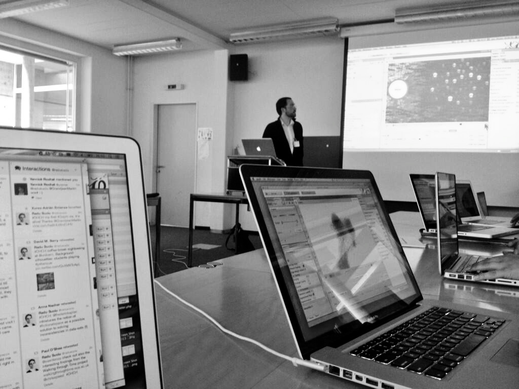
Gephi workshop at University of Bern (photo Radu Suciu)
I propose below, after a short introduction about the basis of SNA and some examples which shows the potential of this tool, a transcript of tutorial given during a workshop of the first Digital Humanities summer school in Switzerland (June 28. 2013), and kept up to date.
1. Short introduction to Social Network Analysis
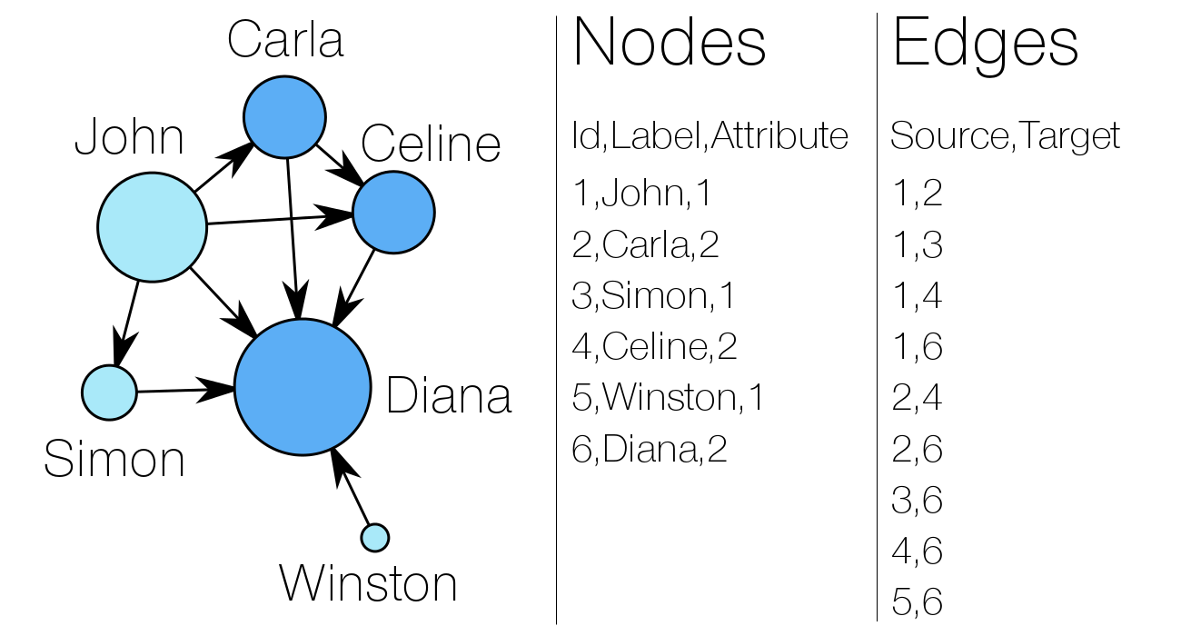
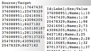
A network consists of two components : a list of the actors composing the network, and a list of the relations (the interactions between actors). As part of a mathematical object, actors will then be called vertices (nodes, in Gephi), and relations will be denoted as tiles (edges, in Gephi).
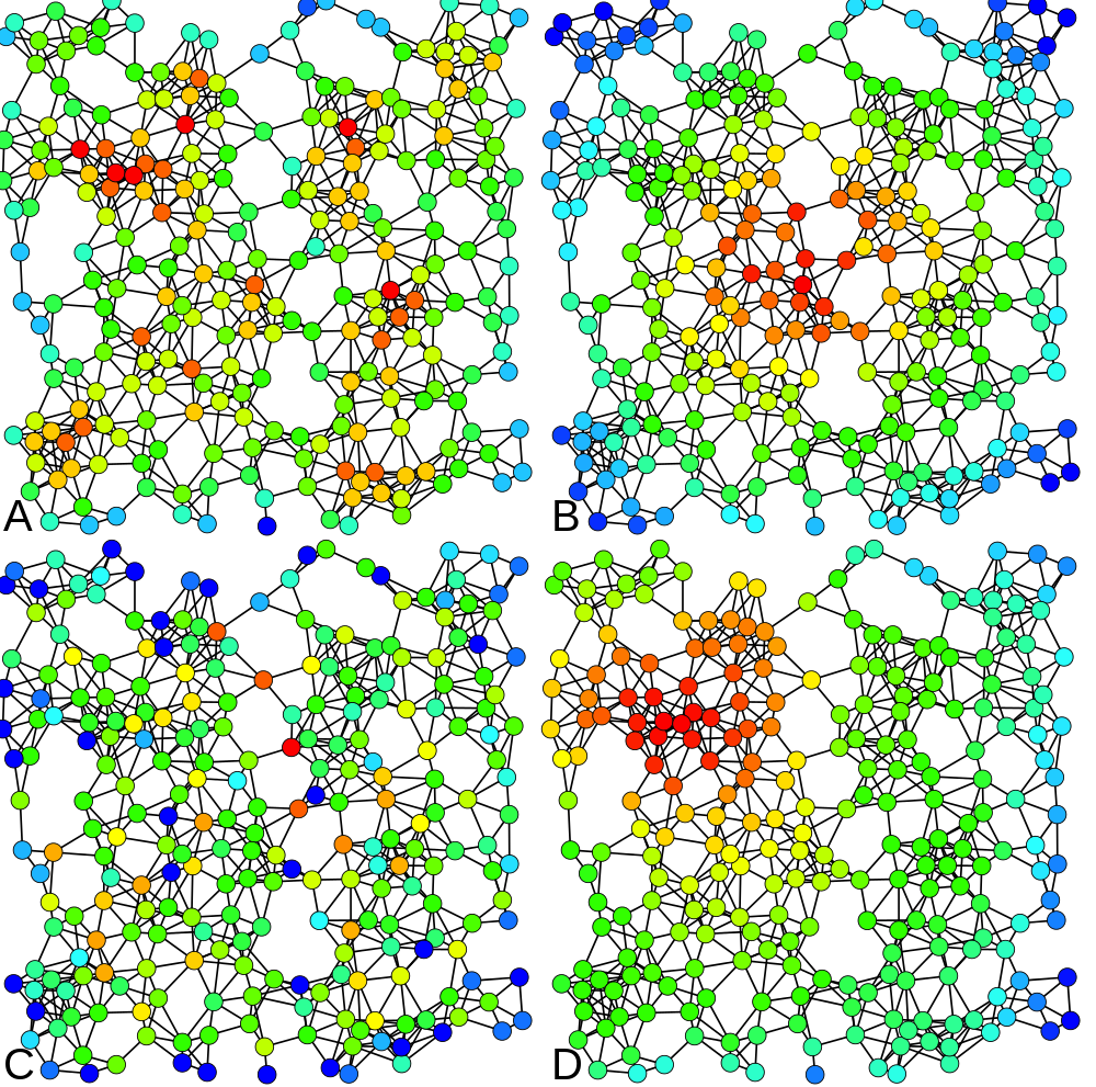
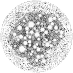
4 types of centrality measures (Claudio Rocchini, Wikimedia)
By left, you can observe a very simple social graph, with both lists explicited. Two attributes are attached to the nodes : a label (his or her “name”) and a numeric attribute (akin to the sex of people here, for example). In the edge list, “Source” and “Target” entries refer to the nodes’ numeric identifiers (Id).
In our example, the “sex” attribute determines the color of the nodes. The size of a node depends on the value of its “degree centrality” (its number of connexions). The centrality measures are essential metrics to analyze the position of an actor in a network. They come in many variations, as shown at right (A = Degree centrality, number of connexions ; B = Closeness centrality, closeness to the entire network ; C = Betweenness centrality, bridges nodes ; D = Eigenvector centrality, connexion to well-connected nodes).
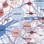
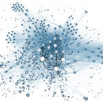
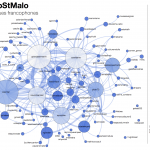
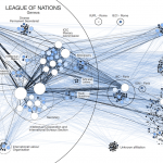
2. Graphs with GEPHI: some examples

3. Downloading GEPHI and the dataset
 GephiDataset(edges)Dataset (nodes)
Download the application and both CSV files. This tutorial is based on the 0.8.2 Gephi beta version. If you encounter a problem due to a later update, do not hesitate to let me know.
 The data consist of a random selection of Twitter users and their “followings” relations. The “Nodes” file contains the identifiers of each nodes, their label, a sex attribute and a random value that will be usefull to play with visualization tools hereafter. The “Edges” file contains a list of identifiers couples showing who follows who.
4. Importing the data into GEPHI
![]()
![]()
Run the application on your computer and create a “new project” in the start menu. In the Data Laboratory, click on “Import Spreadsheet” to open the import window and import your “nodes” file.
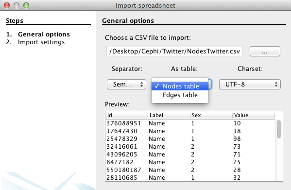
Nodes
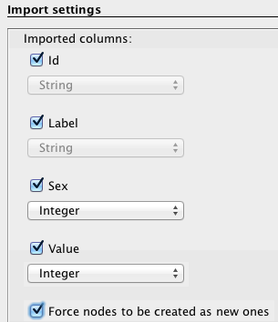
Specify that the separation between your data is expressed by a semicolon and do not forget to inform Gephi that the data you import is related to nodes, as demonstrated in this example (left). Then press “next” and fill the import settings form as proposed (right).
 Edges
Edges
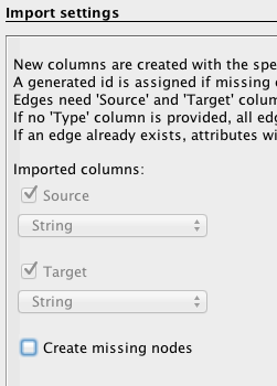
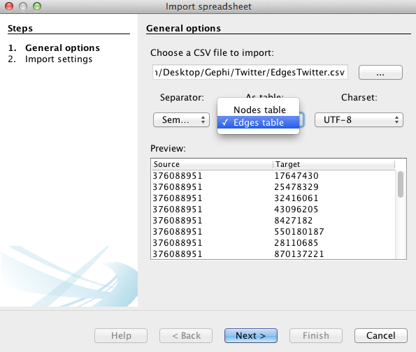
Follow the same procedure as for the nodes, but with the “edges” file downloaded above and by filling the forms in the following manner: specify the semicolon and inform Gephi that this time you import the edges. Fill in the last fields, and uncheck “create missing nodes”, because you’ve already imported them.
.
5. Visualization!
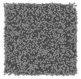
![]() The action now takes place on the overview panel. The software produces an overview of the graph, spatialized randomly (and completely unreadable).
The action now takes place on the overview panel. The software produces an overview of the graph, spatialized randomly (and completely unreadable).
Nodes’ size
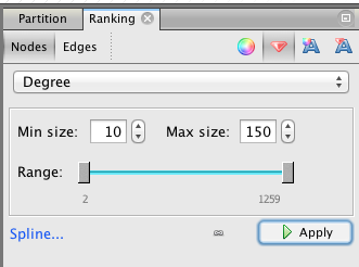 In the “Ranking” panel of the left column (top), select “Nodes” and the “red diamond” (size), then select “Degree” (rolling menu) and enter the minimal and maximal value (we propose 10-150). At that point, it’s possible to click on the “Spline” blue link to edit the shape of the spline (Be aware that linearly double the radius of the nodes is more than double the area because of the power function).
 Spatialization
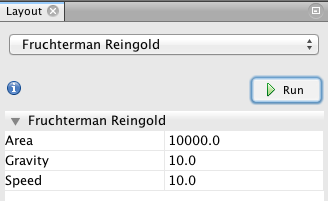 That’s the main part! While it is possible to play (and lose yourself) with various visualization capabilities, I propose a method based on this dataset. Start with Fruchterman Reingold (left column, bottom), and use the same values as in this model (10000 10; 10).
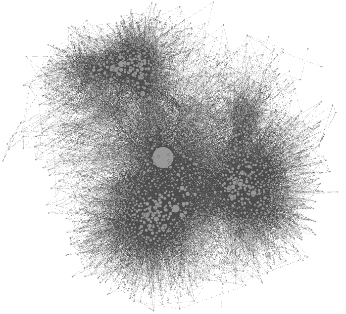
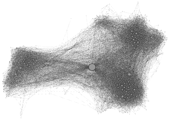
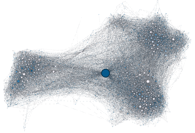
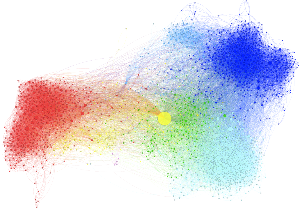
This visualization disposes nodes in a gravitational way (attraction-repulsion, in fact, as magnets). You’re already able to distinguish communities (more densely connected parts of the network). Let the function run until the graph is stabilized. Use the little blue magnifying glass (bottom left of the graph panel) to re-center the zoom.
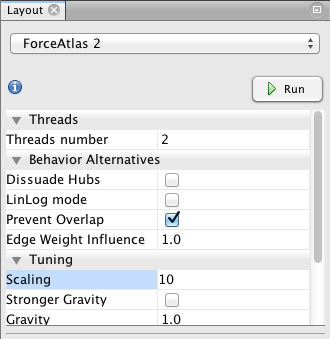
 Then, I propose to use the Force Atlas 2 (another layout algorithm) to disperse groups and give space around larger nodes. Be careful, the parameters you enter significantly alter the final appearance (proposition: Check “prevent overlap” and change “Scaling” to 10). Let the function run until the graph is mostly stabilized.
Nodes’ color
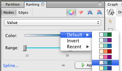
 In the Ranking panel, choose the “color” sign to remove these sad shades of gray. As the nodes have attributes, you can color them regarding their “sex” attribute or their “value” (or simply again with their degree centrality).
Please note that if you used the “Spline” for the Nodes’ size, this setting will be used by default here (but can be modified now without interfering with your previous choice).
Nodes’ label
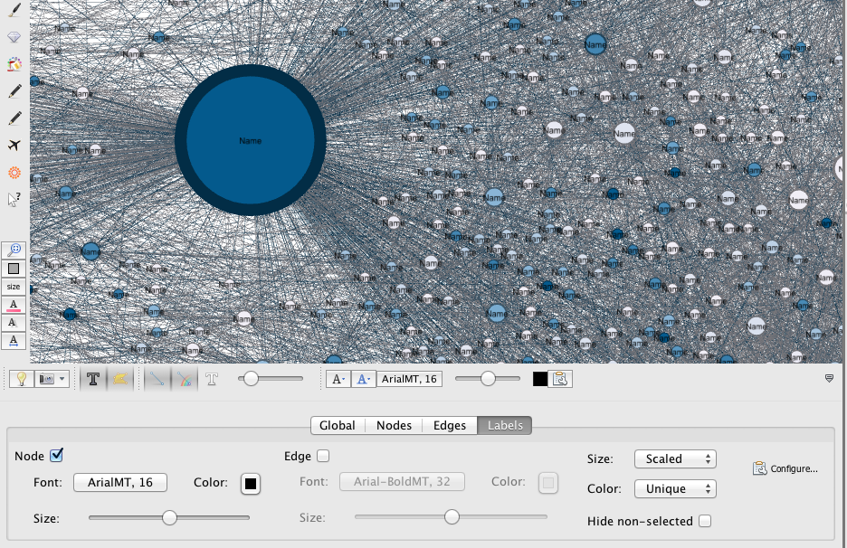 At the bottom right of the graph display, you find a little sign which allows you to develop a new panel. In “Label“, check “Nodes” to add their labels to your nodes and set their font/color/size… If wanted, you can click on the “Configure” link to set the data you want to get displayed.
For privacy reasons, the names are all displayed as “Names” in this dataset. No doubt you understand. Moreover, as the data set has been built (and not collected in a rational manner), the data can not be subject to interpretation.
 Final details
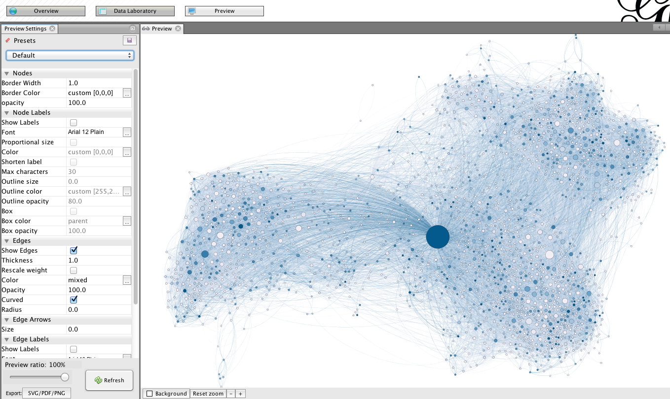
Go to “preview” for trimming the final details. Unlike during previous stages, changing settings in this menu is reversible, and do not affect the structure of the graph. In the this screenshot, you will find a suggestion of settings for a good rendering. Be aware that due to its large size, the graph may take a few seconds to update after each change (click on “refresh” to apply the changes).
At the bottom of this preview column, you find an export link. Note that exporting in .png produces figure with a poor resolution. You may want to opt for .svg or .pdf, which have the advantage of being modifiable by your own image/drawing software (I recommend the open source program inkscape for manipulating .svg files).
6. Other features
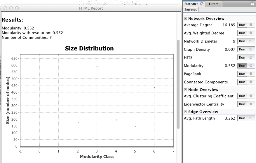 The visualization is only one step, network analysis often needs other mathematical means to provide the researcher with a satisfactory result. Feel free to explore the “Statistics” menu (right), for example by playing with degree measures, density, path length, modularity.
A network contains internal subdivisions called communities. There are methods that permit to highlight these communities, which depend on the comparison of the densities of edges within a group, and from the group towards the rest of the network. More here!
In the right column of the “overview” page, click on Statistics/Modularity/Run to display the modularity window. Choose a resolution (between 0.1 and 2), click OK and close it.
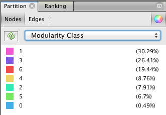
 The next step takes place in the Partition menu situated in the left column. Select “Nodes” and “Modularity Class” (rolling menu). You will be then able to modify the colors attributed to the detected communities by clicking on them.
Do not hesitate to repeat this operation with many “Resolutions” ! If you decide to do so, you must deselect and reselect “Modularity Class” in the left column, and refresh color calculation.
7. Conclusion
Do not forget that what you see of GEPHI is just the tip of the iceberg because the application allows you to install very interesting plugins, has various tutorials and offers a very active forum.
I hope this tutorial has been a way to whet your curiosity to go further in social network analysis, and I am delighted to see your accomplishments!
Very interesting post ! To go further in SNA I recommend the MOOC “Social Network Analysis” by Lada Adamic (University of Michigan) on Coursera
Thank you Claire for the recommendation! I put the link here for any interested: https://www.coursera.org/course/sna
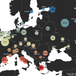
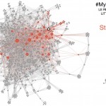
Hi Martin, I’ve been browsing your site — great work! I love how beautiful your graphs are. I am especially interested in replicating something similar to what is in your Figure 1 above (tweets during a DH conference). I left a comment elsewhere in mangled French (smile) asking how you did that. Did you use a plug-in in Gephi to get the figure that way (with the Number of Tweets written, etc., in the right-hand column), or …? In any case, great work. Thanks for sharing. — Greg
Hi, Martin – thank you for this extremely helpful and interesting tutorial – I loved playing with the models in gephi and am looking forward to creating my own models. The explanation of nodes and edges was particularly helpful for me.
Thank you and all the best!
This is a great resource; much clearer and easier to follow than others I had seen. I was sorry not to be in Lausanne for the workshops! Will be sharing with my students. Thanks a lot.
Hi Martin. You’ve created a beautiful site with a very helpful introduction. Thank you very much. My problem is how to prepare the data spreadsheet? Can you please give some advice on that?
Hello, and thank you for your interest!
Of course, the preparation of the spreadsheet is the most important and time consuming point of a network analysis. I have no general advice for you, because it’s always a very personal approach, closely related to the nature of your data. But try always to think it like a list of pairs of individuals (the list of edges, you can download the example-file at pt.3). If the dataset is very large, it’s hard to built it from A to Z, but usually I simply fill an excel spreadsheet with those pairs of node, and export it in .csv
Thank you very much for the marvelous tutorial! I have been avoiding GEPHI because I assumed there was a very steep learning curve and no good information on how to use it.
I’m really glad it could be useful!
Has anyone used Gephi to visualize a large system function call graph?
I would like to ask about a doubt. I tried to do a view of my network of my friends in Facebook using Netvizz, but doesn’t appear the options personal network, that’s why I haven’t got the view. Are there some way I can get this view??
Thank you. The cartography work you have presented is very well done. I have been trying to use GEPHI with geolayout and map of countries to place network data on a global map but the latitudes and longitudes (centroid and capital cities) end up falling outside of most of the countries in map of countries. Would you be able to suggest any solutions? Or have any suggestions to use a different programme to place the network data on the maps?
Hello, thank you for your message (and sorry for the late answer)! Please, have a look at the new version of this tutorial, including some GeoLayout experiments: http://www.martingrandjean.ch/gephi-introduction/ It may help you solve your problem.
If not, could you perhaps describe it more precisely? You seems to have a problem of scale and/or projection, are you working on an editor (as Illustrator/Inkscape) after Gephi?
Thanks for this tutorial, it had indeed made thing clear on how to get started with this software. Thanks again.