Digital History | Data Visualization | Network Analysis
FEATURED
ALL POSTS
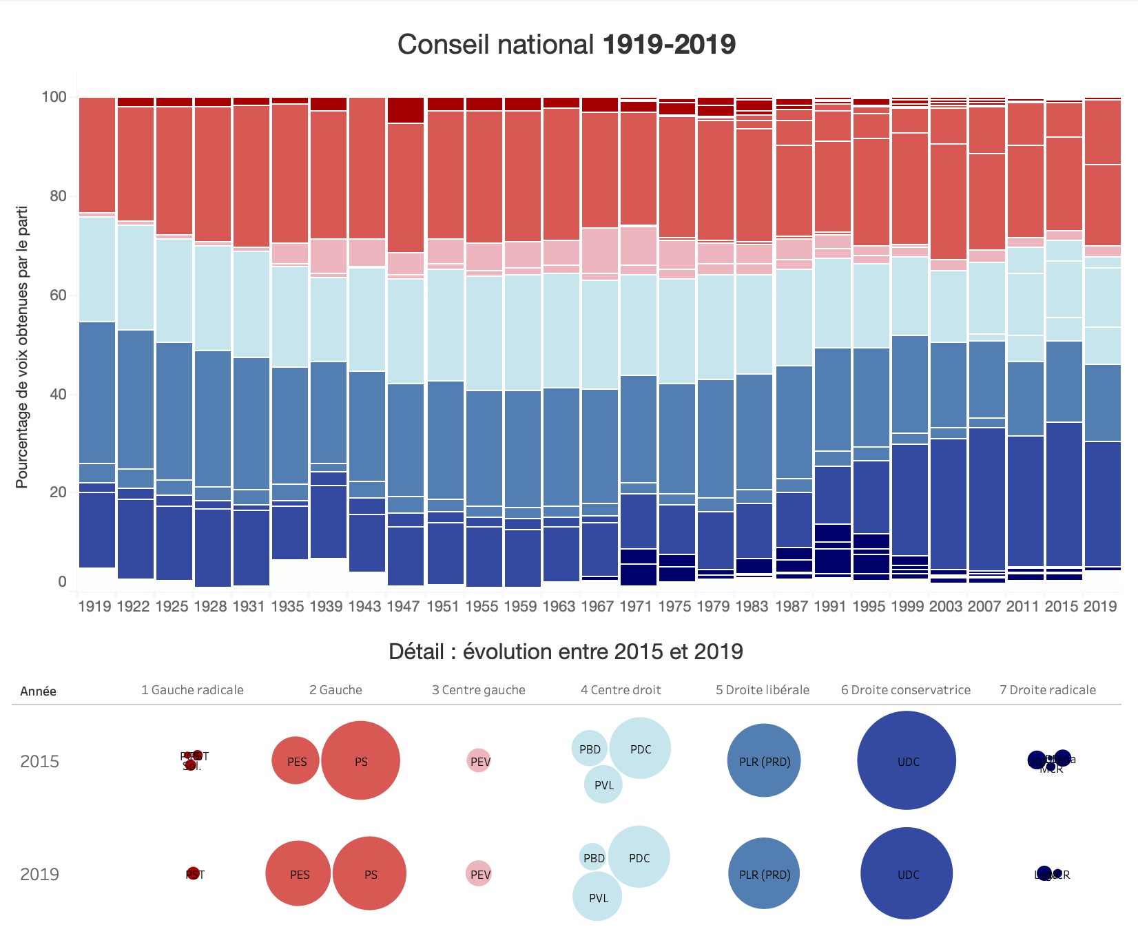
Élections fédérales 2023 : bis repetita ?
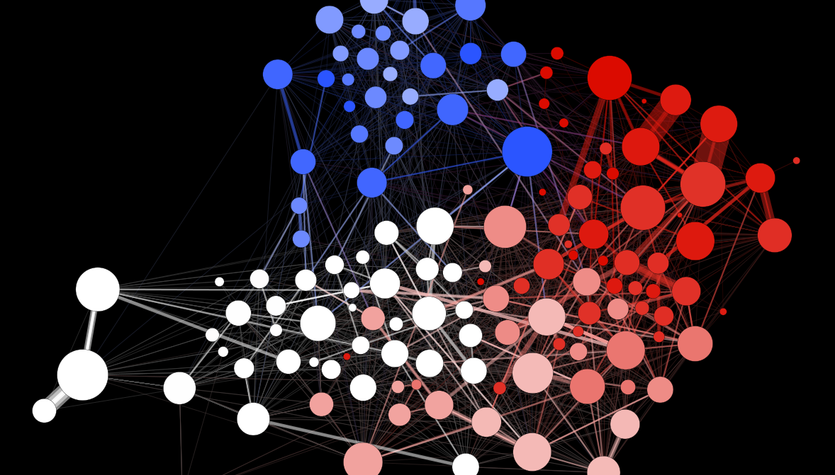
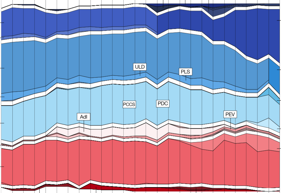
“Victoire de la droite nationaliste“, “défaite des partis écologistes“, sont les titres de la presse suisse et étrangères au sortir de ce dimanche de votations fédérales du 22 octobre 2023. Or, quand on regarde l’évolution de la force des partis politiques au Conseil national (chambre basse) depuis un siècle, difficile d’être frappé par autre chose que la très grande stabilité des équilibres politiques.
Introduction to Social Network Analysis: Basics and Historical Specificities
This video series, intended for a beginner audience, proposes to review the main concepts of social network analysis (terminology, visual analysis, centrality measures, etc.) while highlighting the challenges that arise when analyzing relational historical objects.
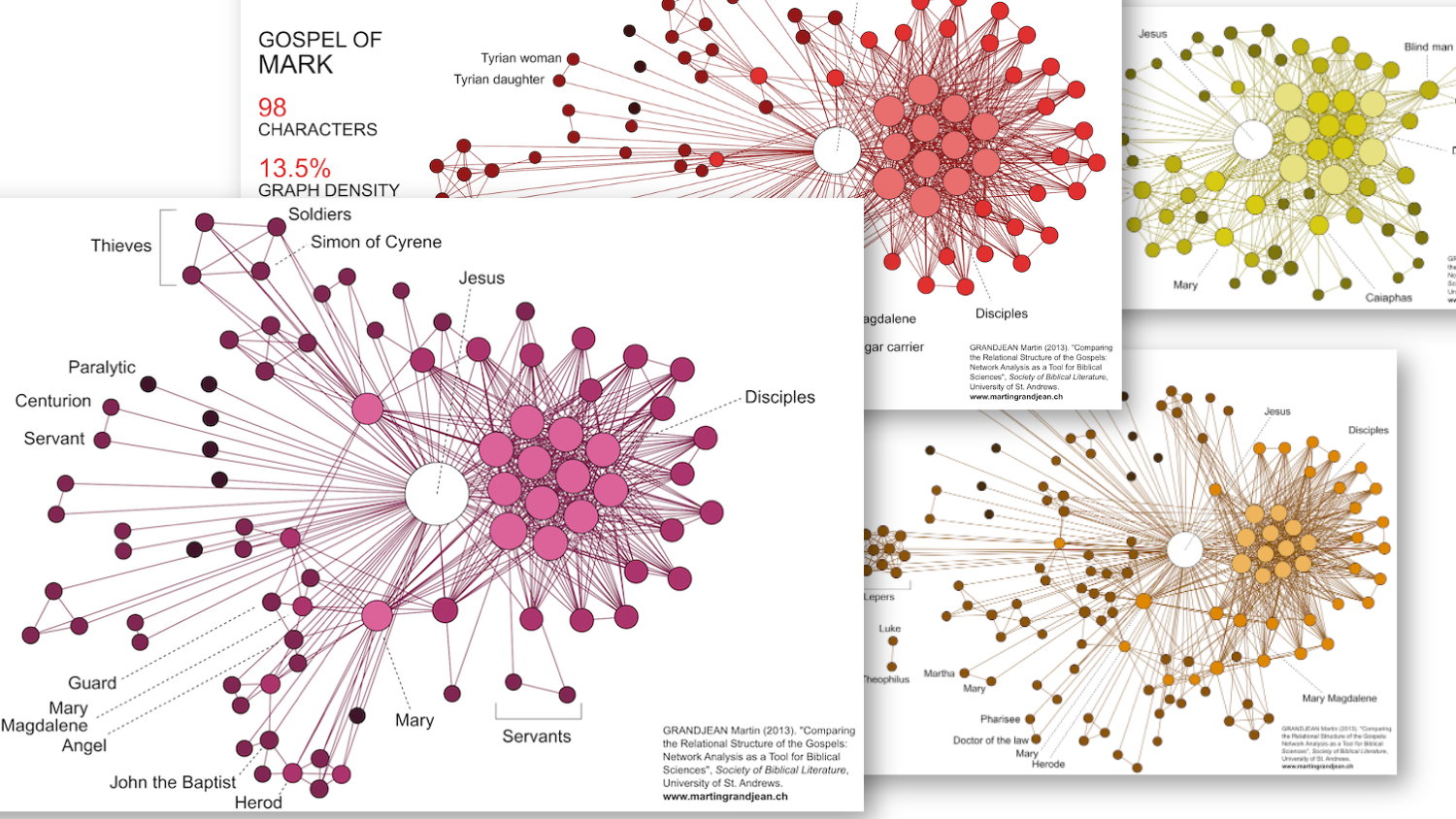
Data Visualization: Mapping the Character Network of the Four Gospels
How are the biblical texts structured? Beyond the obvious centrality of Christ in the Gospels, do we always find the same groups of characters, organized in the same way? This short study raises the question of the potential contribution of network analysis to literary studies and, in particular here, to the biblical sciences.
Network Analysis: Centrality and Periphery in Complex Historical Structures
What is centrality and periphery in global history? It turns out that graph theory, formal network analysis, is all about finding ways to calculate centrality in graphs. How then to make the link between graph theory and historical networks?
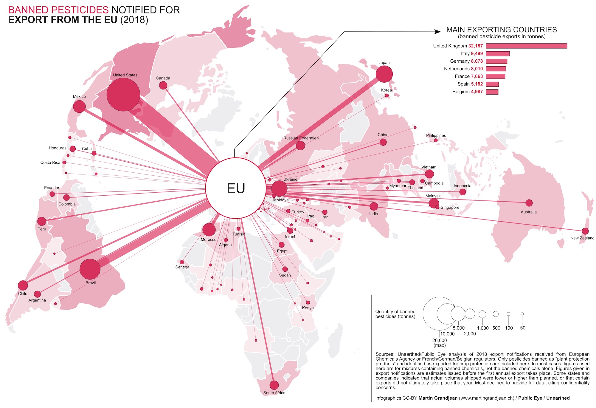
Data Visualisation | European Massive Exports of Banned Pesticides
Banned in the European Union because of their dangerousness, thousands of tonnes of pesticides (such as Syngenta’s Paraquat) are exported every year by countries such as the United Kingdom, Italy, Germany or France. Based on data collected by Public Eye and Unearthed, these visualizations show that many countries around the world use these substances despite being prohibited in Europe.
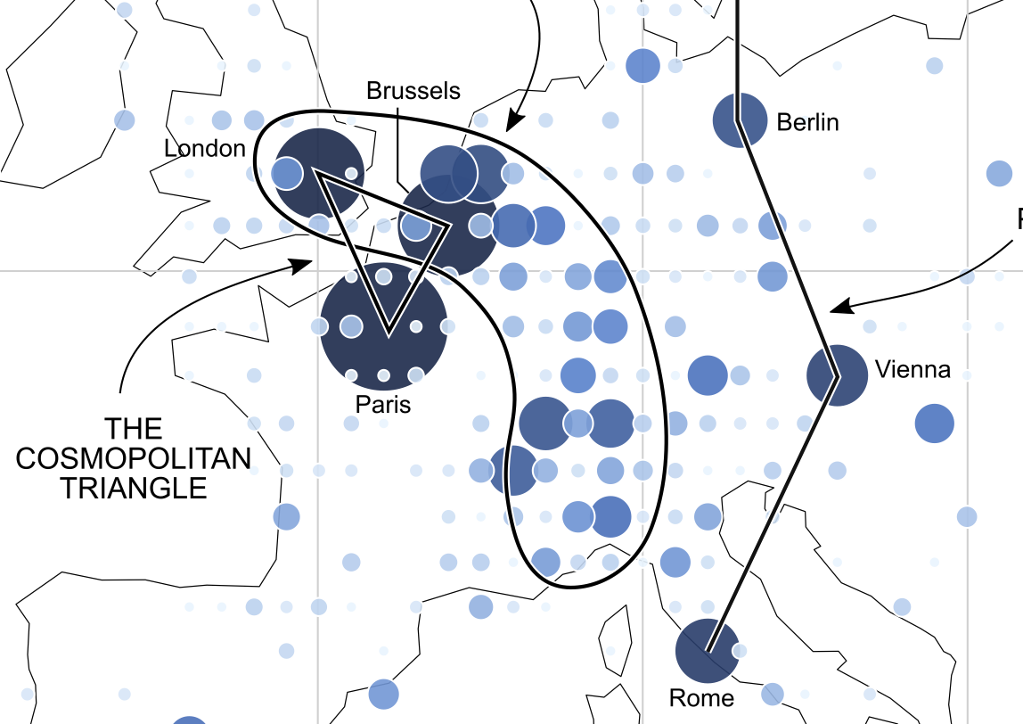
Mapping a Century of International Congresses
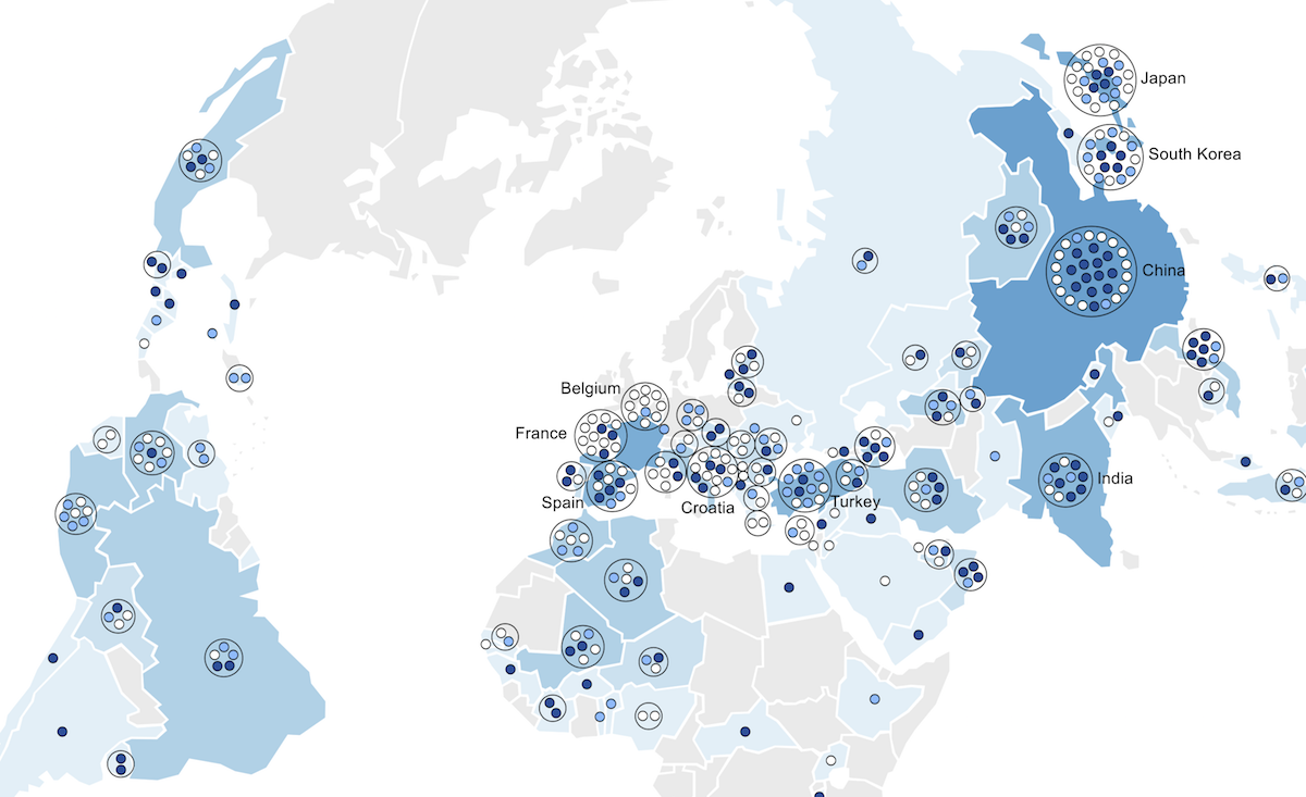
International congresses, meetings of diplomats and experts, have been almost exclusively European events for more than a century. This map shows the location of the +8000 congresses held between 1840 and 1960 and highlights the domination of certain urban areas in Western Europe.
Elections fédérales 2019 : continuité ou rupture ?
Les élections...
Historical Network Analysis: Complex Structures and International Organizations
Confronted with the massification of data and embracing ever more global questions, the history of international organizations is concerned with increasingly complex objects. And if the term “network” is widely used in historical research, it is because it seems to be effective to describe these tangled, evolutionary and multi-level structures.
Complex network visualisation for the history of interdisciplinarity: Mapping research funding in Switzerland
[fivecol_three_first]...
[Visualization] More Americans have died from guns since 2001 than in Korean and Vietnam wars
More Americans have...
Connected World: Untangling the Air Traffic Network
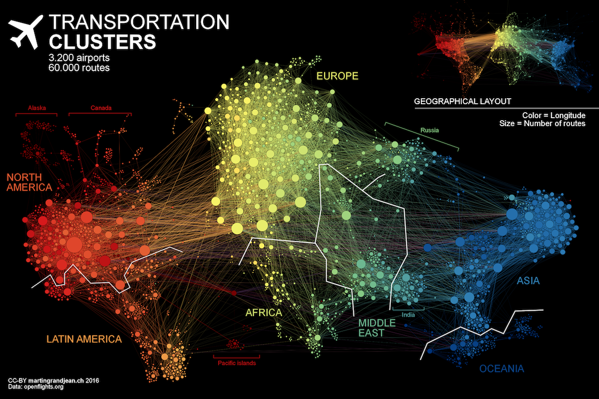
People travel not just...
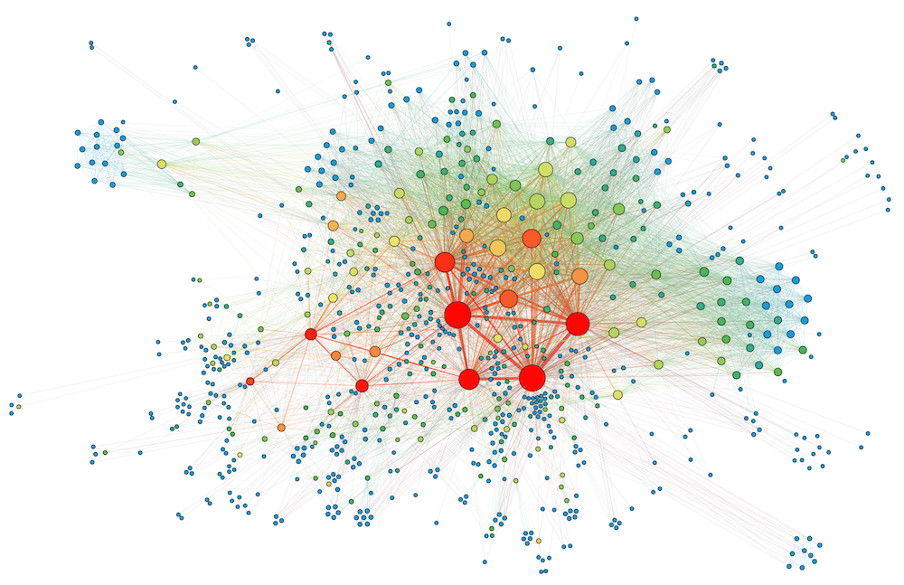
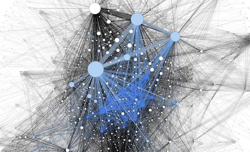
[Network analysis] Mapping the Digital Humanities Community on Twitter
Defining digital humanities might be an endless debate if we stick to the discussion about the boundaries of this concept as an academic “discipline”. In an attempt to concretely identify this field and its actors, this paper shows that it is possible to analyse them through Twitter, a social media widely used by this “community of practice”. Based on a network analysis of 2,500 users identified as members of this movement, the visualisation of the “who’s following who?” graph allows us to highlight the structure of the network’s relationships, and identify users whose position is particular.
Mapping UNESCO Intangible Cultural Heritage
The creation of a list...
L’archive et la massification des données (Bruno Bachimont)
[wp-svg-icons...
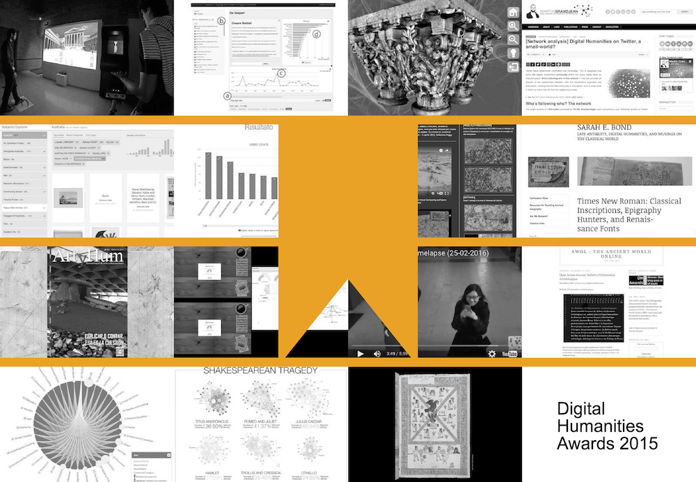
A Year of Digital Humanities: 54 Resources to Explore
As every year since...
Abstraction, Patterns and Forms (Franco Moretti)
[wp-svg-icons...
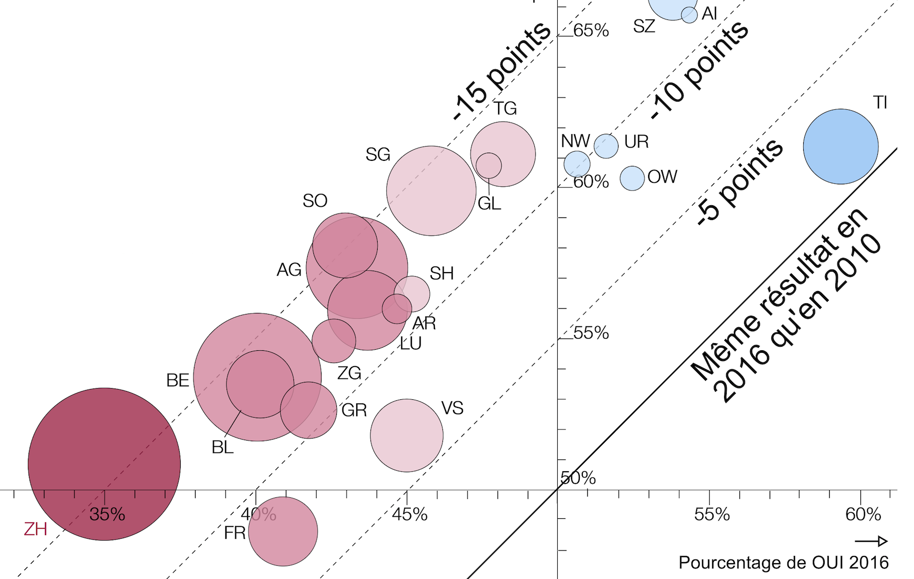
En graphique : l’initiative UDC perd plus de 10 points par rapport à la précédente
L'initiative populaire...
[Graphique] La nébuleuse des exportations d’armes suisses
La Suisse a exporté...
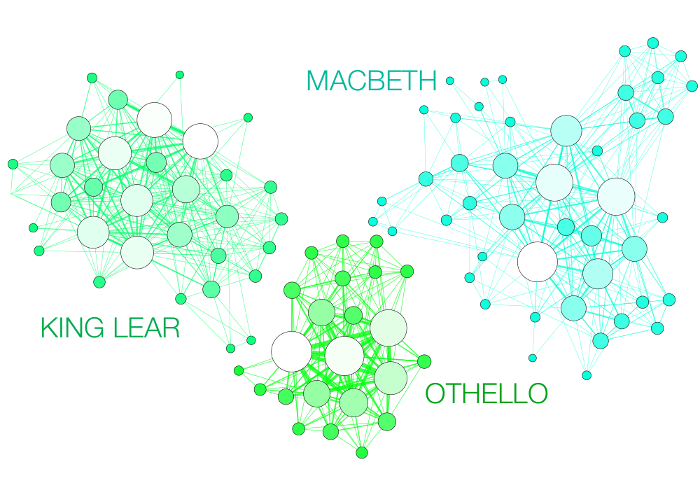
Network visualization: mapping Shakespeare’s tragedies
Are Shakespeare's...
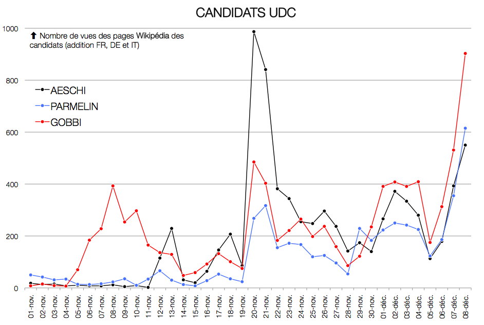
Election au Conseil fédéral : quel intérêt pour les candidats sur le web ?
Wikipédia,...
Timeline : Petite histoire des partis politiques au Parlement suisse
La Suisse est...
François Hollande : L’effort pour les humanités numériques doit être renforcé !
"Je souhaite que cet...
[Data Visualization] More Americans killed by guns since 1968 than in all U.S. wars
More Americans have...
Introduction à la visualisation de données : l’analyse de réseau en histoire
[fivecol_three_first]ABS...

![[Digital History] The Networks of Intellectual Cooperation (1919-1939)](https://www.martingrandjean.ch/wp-content/uploads/2019/02/DigitalHumanitiesLeagueOfNations2.jpeg)
![GEPHI – Introduction to Network Analysis and Visualization [new video]](https://www.martingrandjean.ch/wp-content/uploads/2015/10/miniature.png)


![[Visualization] More Americans have died from guns since 2001 than in Korean and Vietnam wars](https://www.martingrandjean.ch/wp-content/uploads/2016/06/firearms-us2.png)
![[Network analysis] Mapping the Digital Humanities Community on Twitter](https://www.martingrandjean.ch/wp-content/uploads/2016/05/DigitalHumanitiesTwitterNetwork4.png)

![[Graphique] La nébuleuse des exportations d’armes suisses](https://www.martingrandjean.ch/wp-content/uploads/2016/01/swissarms-sanstexte.png)

![[Data Visualization] More Americans killed by guns since 1968 than in all U.S. wars](https://www.martingrandjean.ch/wp-content/uploads/2015/10/firearms.png)
